If you code websites, it’s a good bet that at least one of your clients has asked about or requested a mobile-friendly website. If you go the responsive design route (whereby your website is flexible enough to adjust visually from mobile to desktop widths), then you’ll need a strategy to make images flexible, too — a responsive image solution.
The basics are fairly simple to learn, but once you’ve mastered them, you’ll find that scaling images is only the beginning — you might also have performance and art direction conundrums to solve. You’ll be faced with a wide field of responsive image solutions to choose from, each with its own strengths and weaknesses — and none of them is perfect! This article leads you through the basics, and then arms you with the information you’ll need to pick the best responsive image solution for your situation.

The above Fig Says,
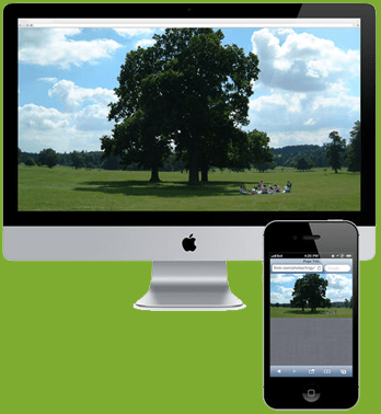
Let’s say you’ve got a beautiful wide image on your home page. It shows a wide bucolic expanse of fields and forest, blue sky and fluffy clouds above, and a happy family having a picnic on the grass.
Now scale it down to 300 pixels wide, mobile-style. At this scale, our vacationing family looks more like the ants at the picnic!
The above Fig Says,
Herein lies what we call the “art direction” problem. Some images just don’t scale well; fine detail is lost, and dramatic impact is reduced. In the case of our hero image, it would be much nicer visually if the mobile version of the photo was zoomed in, cropped and focused on our happy family. To solve this problem, we need a responsive image solution that enables you either to specify different versions of the image for different situations or to adjust the image on the fly.
Leave a Reply