Go to FILE > NEW… and create a new 600px 200px document with a white background. Check the image below if you are unsure about the settings.

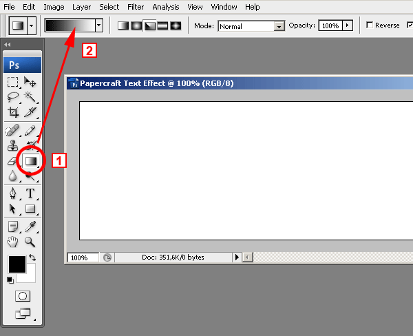
Now let´s create the gradient for the background. In actuality, this is the gradient that we will be using for the text effect. It simply looked nice as the background too. 1 – Select the Gradient tool. 2 – Click on the gradient and the gradient editor window will open.
1 – Create the new gradient using the settings in image below.
2 – Click on the NEW button and give it a recognizable name.
3 – The new gradient will appear on the gradients library.

Select the gradient tool and then from the gradients pull down menu (1), choose the gradient we are just created (2). Select the ANGLE GRADIENT option

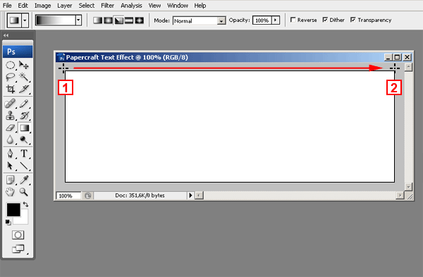
Check the image below to see how to apply the gradient. Place the cross on the top left corner of the image and drag it to the right.
It is very important to start (point 1) the gradient at the very top left corner of the image or even outside the image, but never inside the image, it won´t look good.
Since we are using the ANGLE GRADIENT option, it doesn´t matter where you release the mouse (point 2) as long as you keep the line horizontal.
You should get a result similar to this image:

Get ready the Text
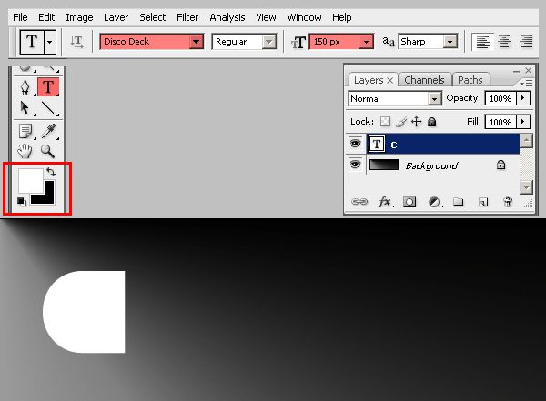
Before starting, download the Disco Deck font and install it on your system. After installing the font, select the Text tool, set 150px as the font size, and type the letter C.
Press CTRL + ENTERto release the tool. Click again with the text tool and a new text layer will be created. Type the letter R and release the tool again by pressing CTRL + ENTER . Do the same over and over until you have all the five letters on a different text layer each:

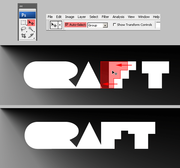
Now we are going to arrange the letters to get the overlapped look of the final effect.
That should be fairly easy. Just select the MOVE tool, check the AUTO SELECT option, and drag each letter closer to the other and overlap them as much as you want.
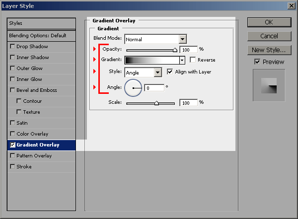
Go to the LAYERS PALETTE and select the layer with the letter C in it. Then choose GRADIENT OVERLAY from the Layer Effects pop-up menu.

DON´T press OK yet. Remember to use the new gradient we have already created some steps before:
Now click on the DROP SHADOW Layer Effect and use the following settings. Keep the window open, DON´T press OK yet.

Click on the STYLES option on the top of the window and then click on the NEW STYLE button and give it a name. The newly created style will show last on the list of styles. Now you can press OK to close the LAYER STYLES window.:
To apply the new style to each letter you must select a layer (1) and then click on the new style on located on the STYLES PALETTE (2).
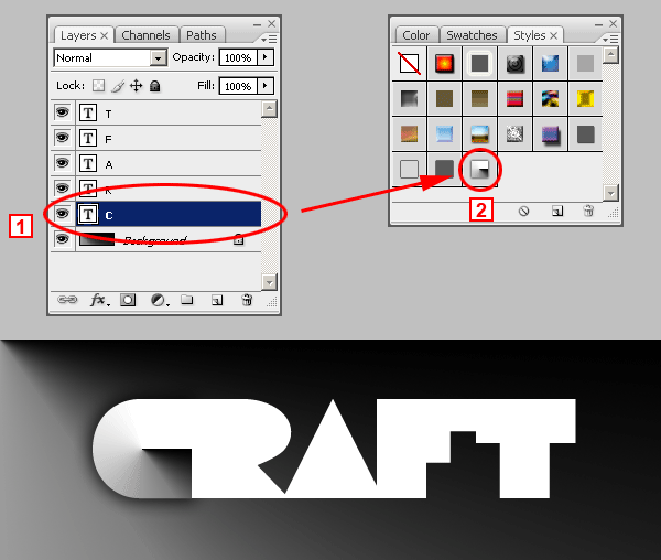
Repeat the same for each letter. Don´t worry about the results. They will look incorrect but we will deal with that later. You will end up with something like this:
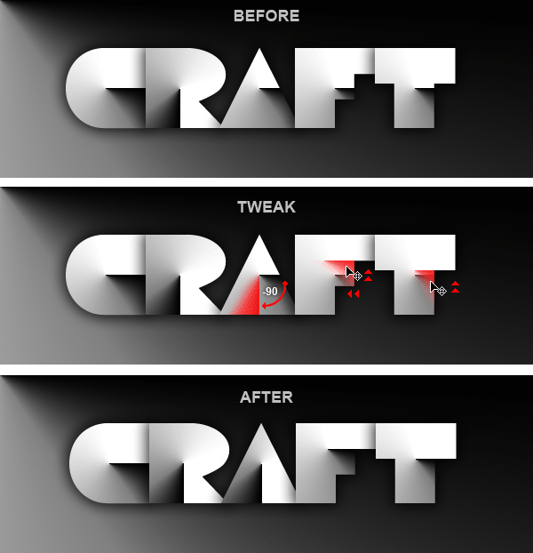
Although the effect is complete, the simulated paper cuts don´t look good. Let´s correct that. Go to the LAYERS PALETTE, select the layer with the letter R and click on the tiny arrow at the right (1). This will display all the Layer Effects of the text layer. Double click on the GRADIENT OVERLAY effect (2). This will open the LAYER STYLES window displaying the Gradient Overlay settings.

Move the LAYER STYLE window until you can see the letter R. You should do this because you can only edit the gradient position of the letter R while the LAYER STYLE window is open.

First, type -90 in the Angle setting of the Gradient Overlay window or you can also drag the gradient angle selector until it reads -90 degrees You will see how the letter R gradient has changed its rotation and it is vertical instead of horizontal. In the next step we will move the gradient a little bit to the left to make it look better.

You should still have the LAYER STYLES window open. If not, then open it as explained a couple of steps above. Now check at the top of the screen and you will se a message that says Click and drag to reposition the gradient. This means that while the LAYER STYLES window is open, you will be able to exactly click and drag the gradient inside the letter R, and reposition it at will.


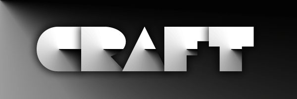
When you are done, close the LAYER STYLES window. You image should now look like this one:
To reach the desired result, you should continue tweaking the rest of the gradients until they look like the final result. Check the image below to see a diagram of the changes you should make:
Giving a Touch of Color
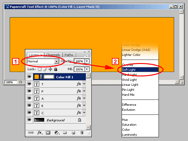
Choose a color. Any color you want. You will be able to change it later. In this case we used #FFA200. Click OK and the layer will be filled with that color.

After that, Go to the LAYERS PALETTE and from the BLENDING MODES pull down menu (1), select SOFT LIGHT (2).
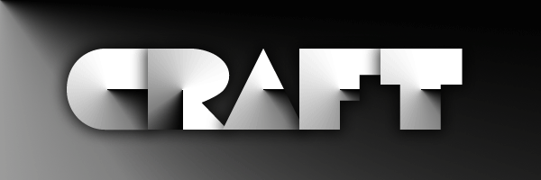
Finally! Here´s the finished Paper craft Text Effect.

Leave a Reply