Archive for February, 2014
Stylish Text Effect
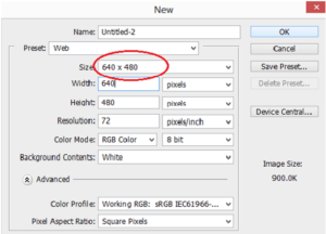
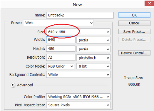
Step 1 : Open a new Photoshop document
In the first step, open a new document with preferred size.
We can use the keyboard shortcut ctrl+N to open a new document.
Step 2 : Fill the document with Balck
Set the foreground color as Black. Use the keyboard shortcut Alt+Backspace to fill the document with foreground color.


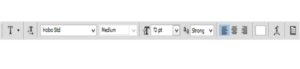
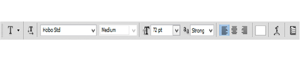
Step 3 : Add your text to the Document
Grab the type tool from the tools palette otherwise press T to work with keyboard shortcut.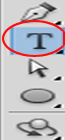
Go to the option bar set font color, font size and font style.
Press letter X to swap foreground and background color so that we get white as a foreground color.
Type the text plastic and resizing the text size by pressing ctrl+T.
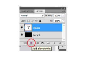
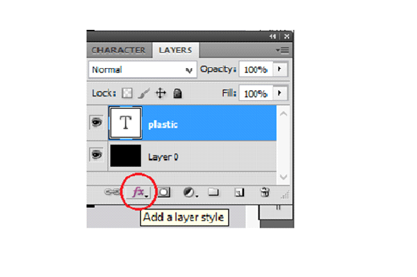
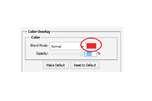
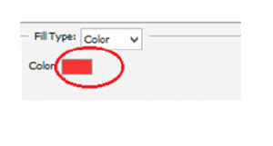
Step 4 : Choose a color for your text using the color overlay layer style
To create plastic effect first we have to choose color overlay from layer styles which is in bottom of layer palette.
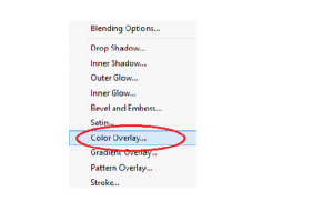
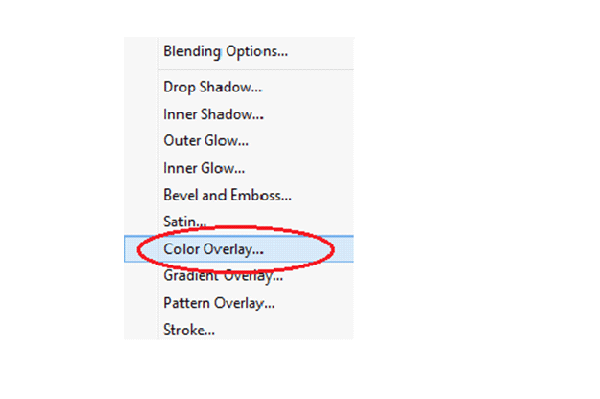
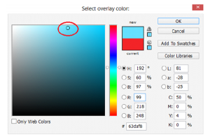
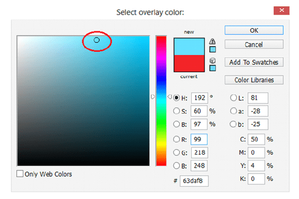
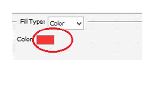
It brings up a color overlay dialog box. Click on color swatch and pick a lighter shade of the color.
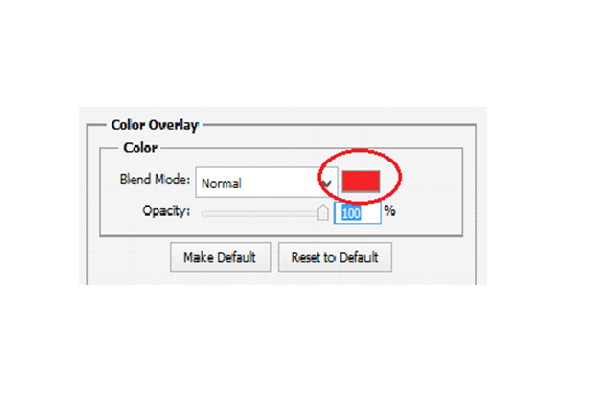
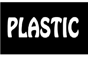
Now the text color will appear like this

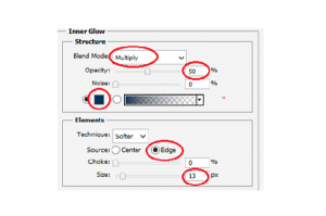
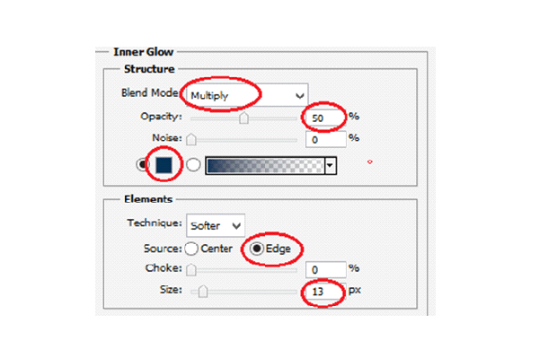
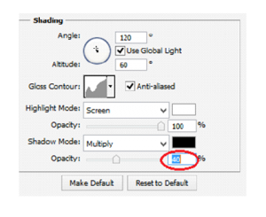
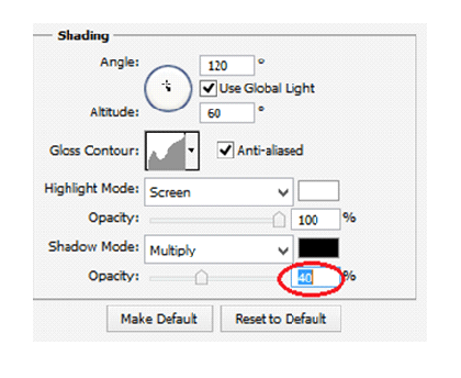
Step 5: Add An Inner Shadow To The Text Using The “Inner Glow” Layer Style
Now we are going to give a three dimensional look for our text by choosing Inner glow style.
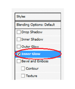
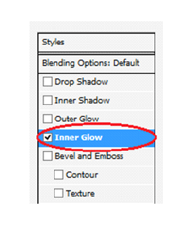
Change the blend mode to multiply and change an opacity also to 50%.
Click on color swatch and pick a matching color, source will be an edge and the shadow size will be 13 pixels.
Now the text will look something like this

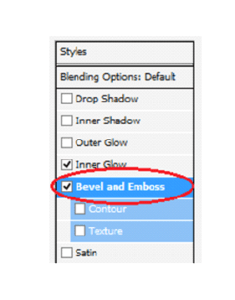
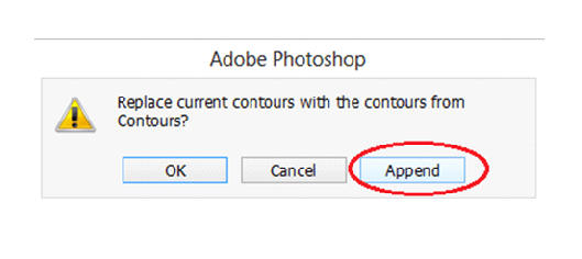
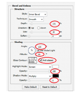
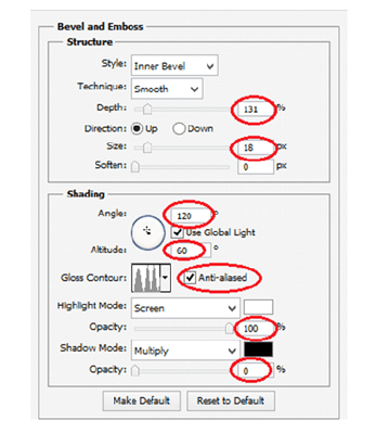
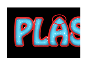
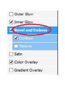
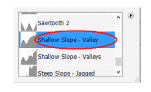
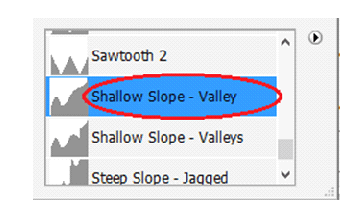
Step 6: Apply The “Bevel and Emboss” Layer Style
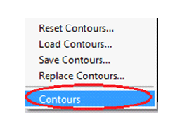
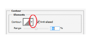
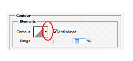
We have to add Bevel and Emboss effect to our text. For doing this we want to load new contours and append that.
To load new contours click on the down pointing arrow to the right side of the contour preview thumbnail.
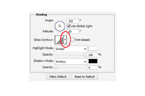
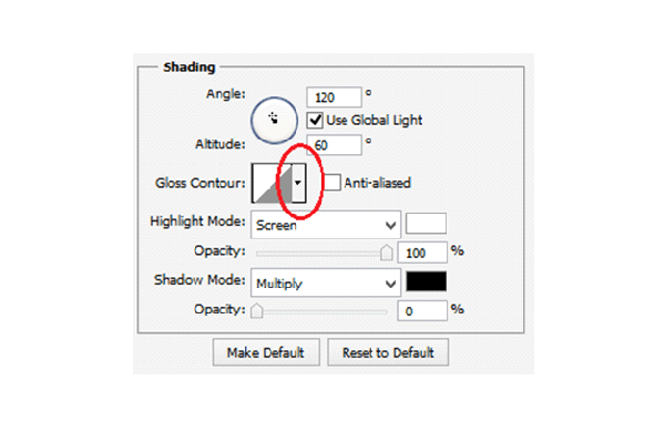
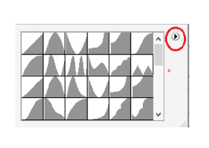

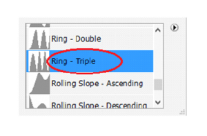
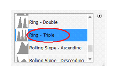
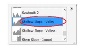
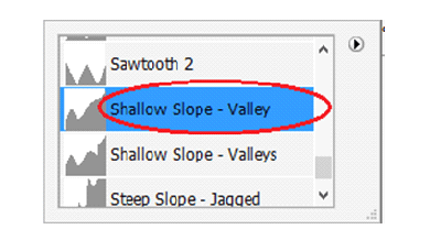
Select Large list from the options so that we can see both thumbnail preview and name of the contour .
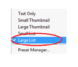
Select the Ring-Triple and change the rest of Bevel and Emboss options.
Now the text looks like this

Step 7: Apply The “Contour” Layer Style
Add the contour layer style from the layer style palette.
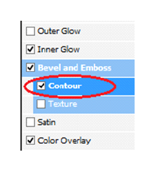
Change the contour style and range to create plastic effect on our text
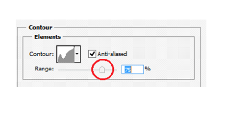
After adding contour style the text will appear like this


Step 8: Duplicate The Text Layer
Duplicate the text layer so now there are two text layers in the layers palette.
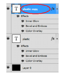
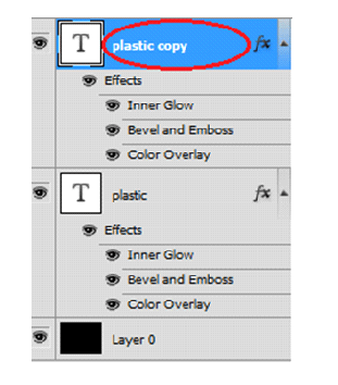
Click on the original text layer, once again doing some changes in the original text.
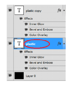

Step 9: Add a Stroke To The Text
Click on layer style to create stroke effect on the text.
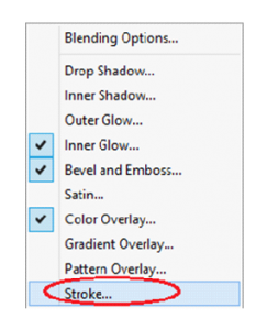
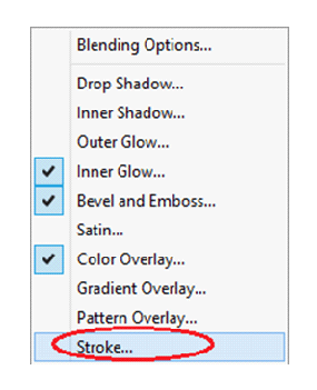
Change the Range and color
Move the mouse over the text we will see our mouse cursor will change into eyedropper icon.
Then click near the edge of one letter to sample shade of the color.
Then choose color midway between lighter and darkest colors in the text.

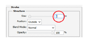
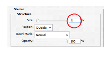
Step 10: Apply The “Bevel and Emboss” Style To The Stroke
Once again wsitch to Bevel and Emboss style to stroke itself.
Click on the down pointing arrow to change to stroke emboss.
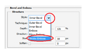
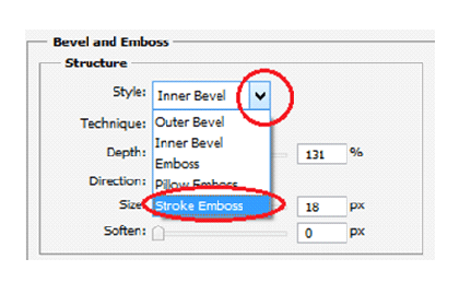
Then change contour style and range
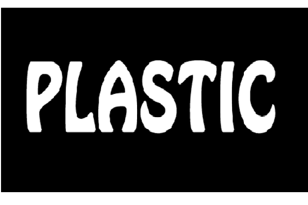
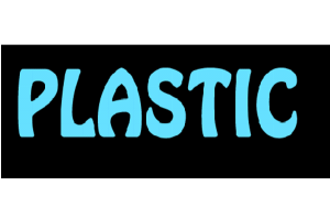
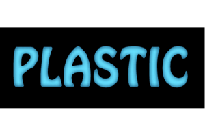
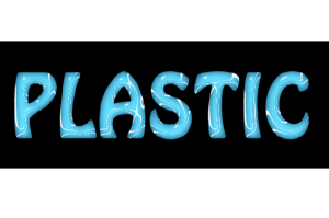
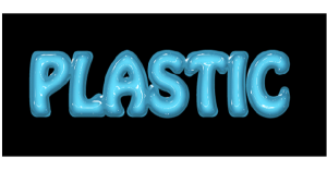
Finally we get the text with plastic effect

CHOOSING RIGHT SIZE IMAGE(responsive) IS THE BEST SOLUTION FOR RESPONSIVE TEMPLATE
If you code websites, it’s a good bet that at least one of your clients has asked about or requested a mobile-friendly website. If you go the responsive design route (whereby your website is flexible enough to adjust visually from mobile to desktop widths), then you’ll need a strategy to make images flexible, too — a responsive image solution.
The basics are fairly simple to learn, but once you’ve mastered them, you’ll find that scaling images is only the beginning — you might also have performance and art direction conundrums to solve. You’ll be faced with a wide field of responsive image solutions to choose from, each with its own strengths and weaknesses — and none of them is perfect! This article leads you through the basics, and then arms you with the information you’ll need to pick the best responsive image solution for your situation.

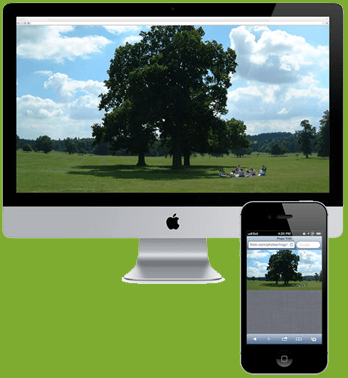
The above Fig Says,
Let’s say you’ve got a beautiful wide image on your home page. It shows a wide bucolic expanse of fields and forest, blue sky and fluffy clouds above, and a happy family having a picnic on the grass.
Now scale it down to 300 pixels wide, mobile-style. At this scale, our vacationing family looks more like the ants at the picnic!
The above Fig Says,
Herein lies what we call the “art direction” problem. Some images just don’t scale well; fine detail is lost, and dramatic impact is reduced. In the case of our hero image, it would be much nicer visually if the mobile version of the photo was zoomed in, cropped and focused on our happy family. To solve this problem, we need a responsive image solution that enables you either to specify different versions of the image for different situations or to adjust the image on the fly.
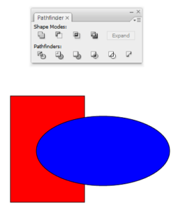
USE OF PATHFINDER TOOL IN ADOBE ILLUSTRATOR
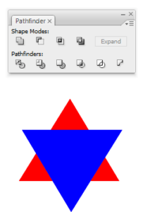
The pathfinder tool in Illustrator is one of most useful tools for manipulating paths. You can find the pathfinder tool by going to Window > Pathfinder.
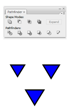
Initially:

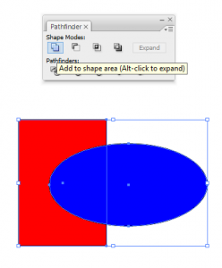
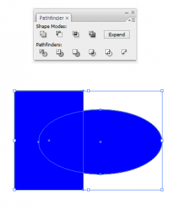
Unite combines all selected shapes into one shape.
Before:


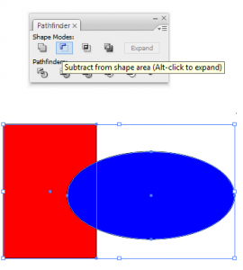
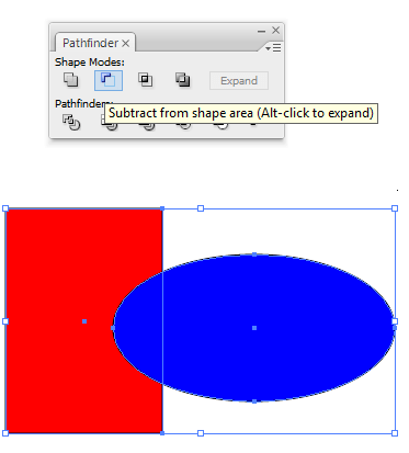
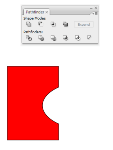
Minus Front of the selected shapes, takes the bottom-most shape (in your Layers) and subtracts all other selected shapes from itr.
Before:
After:

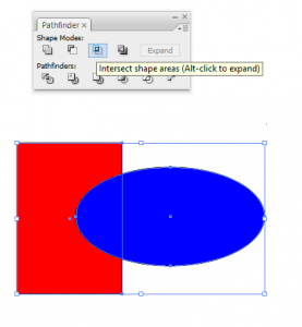
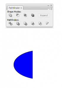
Intersect results in the intersection of the selected shapes.
Before:

After:

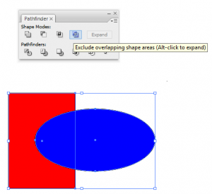
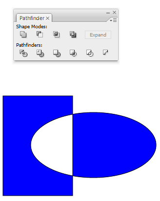
Exclude excludes the overlapping areas of the selected shapes
Before:

After:

Coming…, The six pathfinders are a little hard than the shape modes, but very useful.
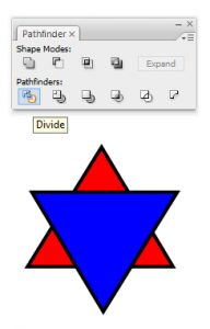
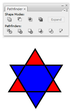
Divide separates the selected shapes into parts, which take on the overlapping color.
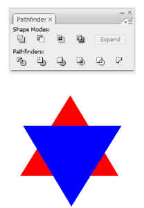
In the image above, on the left are two separate triangles, one overlapping the other. On the right is the result after Divide is used. (All subsequent images follow a before on the left, after on the right format.)
Before:


Merge is very similar to Trim; it separates the selected shapes into parts while preserving top layers, but also merges overlapping shapes of the same color.
Before:
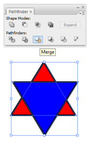

After:

Minus Back works with two shapes, and takes subtracts the bottom shape from the top shape.
Before:
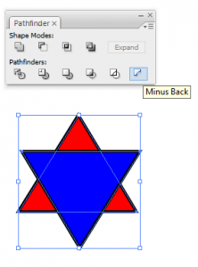

After:
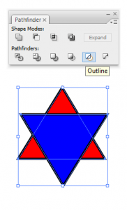
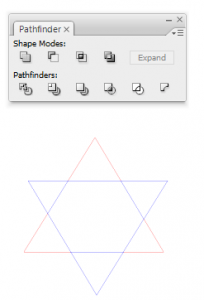
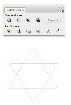
Outline results in the outline of each shape, split into parts; each part takes on the color of the top-most layer.
In the above image, the sections have been moved out of their original outlined positions for clarity.
Before:

After:
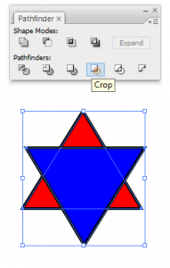
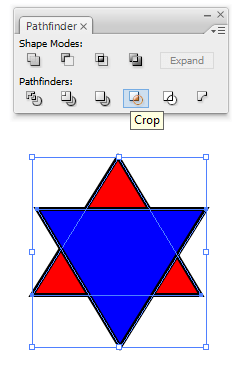
Crop takes the shape of the top layer that is selected and crops out everything from all the other selected layers that is not within that shape, in the color(s) of the other layer(s). The above image shows three overlapping shapes and the results of using the crop tool if different shapes were the top layer. For example, on the left, the circle layer is the top layer, so the circle shape is preserved but what results is the parts of the layers underneath that are within the circle. It may be easier to think of the crop tool as a cookie cutter; you only want whatever is within the shape of the cookie cutter.
Before:

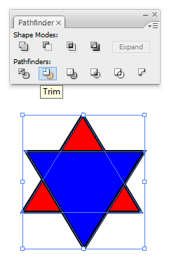
In the image above, on the left are the same two separate triangles as before. When Trim is used instead of Divide, the blue triangle, which overlaps the yellow one, is preserved.
Before:

After: