

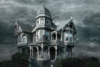
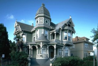
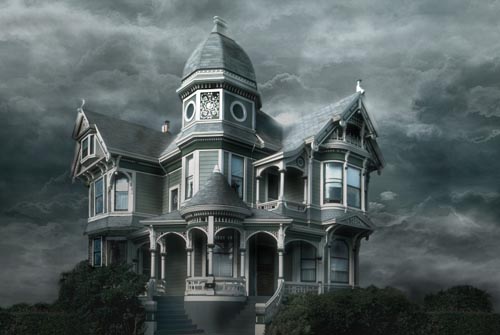
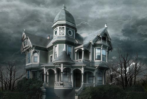
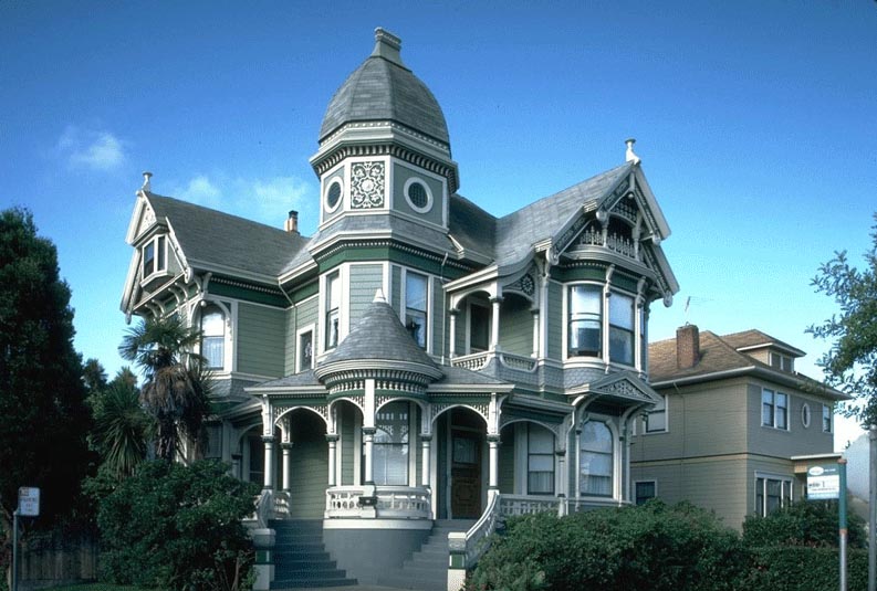
First of all, find a good res picture. I chose to use a picture of a house I found on the web. You can find very nice pics for free, just look around !
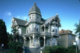
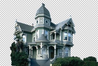
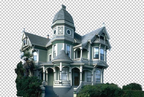
The first step is to isolate the house by putting it on a separate layer and by erasing the rest.
In this example I used the polygonal lasso tool for the house, and a soft eraser for the bushes.
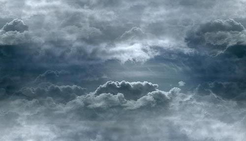
Now you need a new background. You can either find a good pic, either paint one yourself.
I chose the former because it is less time consuming, and the result is far better than what I would have gotten had I painted a background myself. I found this image on the web, unfortunately I do not remember the site I got it from.

Put the sky behind the house (by putting the sky layer under the house layer), and apply a little perspective effect to give more depth to the sky, make it less flat.
Here the house picture was taken from a low angle, which makes our work easier.
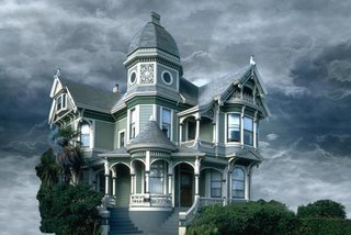
Now look at the edges of the house. They still are the color of the original sky. We'll fix that.

Using the magic wand tool, select the empty zone of the house layer. Then, Select > Modify > Expand, to make your selection wider. Pick a value that includes the zone we need to color correct.
In the menu : Image > Adjust > Hue / Saturation and color correct the edges by matching them with the color of the roof.

Still using Hue / Saturation and also Color Balance, adjust the colors of the house and sky layers so that they perfectly blend together.
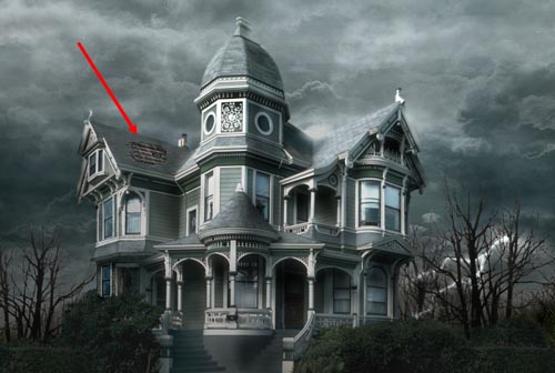
Now we want to get rid of that palm tree that hides a part of the house. That tree has nothing to do there since we want to create a morbid mood.
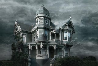
This is probably the most delicate step because we have to hand paint the missing part of the house. For that I mostly used the clone stamp tool, tool that allows you to paint something using another part of the picture for reference.
For instance, the tiles located between the lower and middle windows were painted using similar tiles of the house, using the clone stamp tool.
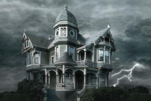
Why not add a lightning bolt to make the scene a little more disturbing ?
Using the simple non feathered brush, this is simple. Draw your lightning, duplicate the layer, and blur the copies to make the lightning glow.
Then, use the Dodge tool to brighten the clouds from where the lightning is originating.
Paint dead trees behind the house, or use existing ones from pictures. Of course, make the colors and luminosity match.

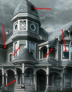
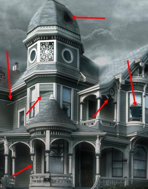
The fun part, now ! Let's break down the house. Well, not all of it.
To make it look older, I added a hole in the rood, painted with brushes.

Don't be afraid to add broken parts ! The house is supposed to still be standing, so don't go too far.
You can see that I broke a wooden beam, a pipe, a board, another part of the roof, and a window. When you break something, use the clone stamp tool to fill in the empty space you created.
Make it look dirty. First of all, the windows. I used a non regular brush and painted the windows with a matte color. Then, change the transfer mode of the dirt layer to make sure that dirt and windows blend nicely together. For this example I chose the Luminosity mode.
Repeat that step, only do it on the entire house. Paint with a dirtier color and set your layer to Multiply.
Make sure you make joints and edges look filthy too, because that's where dirt appears most.
This is one of the longest steps, but take your time and don't mindlessly add dirt everywhere !

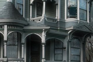
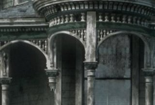
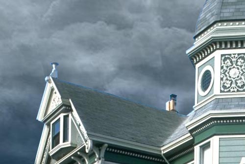
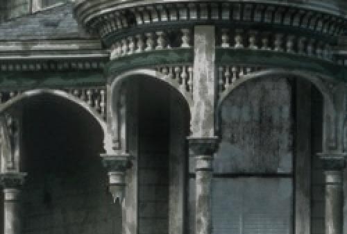
Here, the porch, zoomed in.
The last step is to create a Levels adjustment layer to get the final contrast of the matte painting.

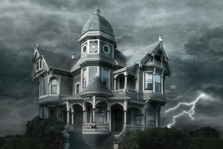
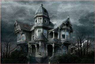
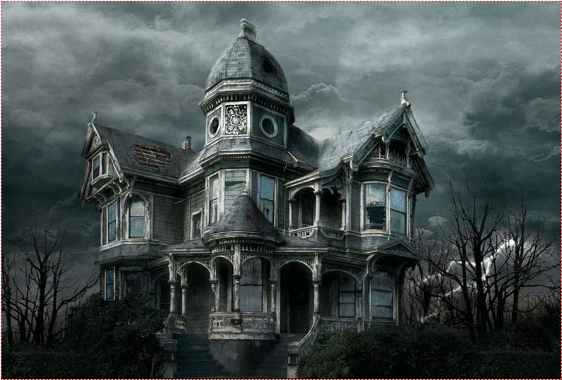
Here it is ! You can compare the original image and the matte painting !

The first step is to isolate the house by putting it on a separate layer and by erasing the rest.
In this example I used the polygonal lasso tool for the house, and a soft eraser for the bushes.
Now you need a new background. You can either find a good pic, either paint one yourself.
I chose the former because it is less time consuming, and the result is far better than what I would have gotten had I painted a background myself. I found this image on the web, unfortunately I do not remember the site I got it from.
Put the sky behind the house (by putting the sky layer under the house layer), and apply a little perspective effect to give more depth to the sky, make it less flat.
Here the house picture was taken from a low angle, which makes our work easier.

Now look at the edges of the house. They still are the color of the original sky. We'll fix that.
In the menu : Image > Adjust > Hue / Saturation and color correct the edges by matching them with the color of the roof.

Still using Hue / Saturation and also Color Balance, adjust the colors of the house and sky layers so that they perfectly blend together.

Now we want to get rid of that palm tree that hides a part of the house. That tree has nothing to do there since we want to create a morbid mood.
This is probably the most delicate step because we have to hand paint the missing part of the house. For that I mostly used the clone stamp tool, tool that allows you to paint something using another part of the picture for reference.
For instance, the tiles located between the lower and middle windows were painted using similar tiles of the house, using the clone stamp tool.
Why not add a lightning bolt to make the scene a little more disturbing ?
Using the simple non feathered brush, this is simple. Draw your lightning, duplicate the layer, and blur the copies to make the lightning glow.
Then, use the Dodge tool to brighten the clouds from where the lightning is originating.
Paint dead trees behind the house, or use existing ones from pictures. Of course, make the colors and luminosity match.
The fun part, now ! Let's break down the house. Well, not all of it.
To make it look older, I added a hole in the rood, painted with brushes.
Don't be afraid to add broken parts ! The house is supposed to still be standing, so don't go too far.
You can see that I broke a wooden beam, a pipe, a board, another part of the roof, and a window. When you break something, use the clone stamp tool to fill in the empty space you created.
Make it look dirty. First of all, the windows. I used a non regular brush and painted the windows with a matte color. Then, change the transfer mode of the dirt layer to make sure that dirt and windows blend nicely together. For this example I chose the Luminosity mode.

Repeat that step, only do it on the entire house. Paint with a dirtier color and set your layer to Multiply.
Make sure you make joints and edges look filthy too, because that's where dirt appears most.
This is one of the longest steps, but take your time and don't mindlessly add dirt everywhere !

Here, the porch, zoomed in.
The last step is to create a Levels adjustment layer to get the final contrast of the matte painting.

Here it is ! You can compare the original image and the matte painting !
Labels: Photoshop tips.
posted by vonteity @ 9:42 PM permanent link | |
Start by typing your text using a nice font.  Right click the layer in layer palette and rasterize it. Ctrl+Click the layer thumbnail to get the selection.   Press Shift+Ctrl+D to feather the selection. Use settings as shown. 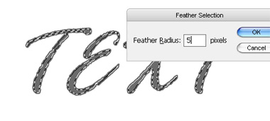 Press delete to remove the text area inside selection.  Duplicate layer. Select original layer. From filter menu select blur>>radial blur. Apply settings as shown. 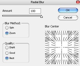  From filter menu select sketch>>chrome. Apply settings as shown. 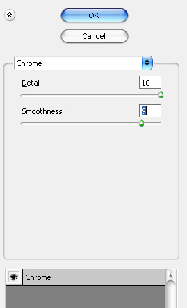  Press Ctrl+U to open hue/saturation window. Apply settings as shown. 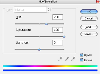  Select the duplicate text layer. Double click the layer to open layer style window. Apply settings as shown. 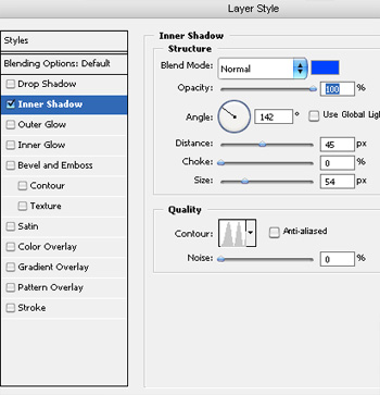 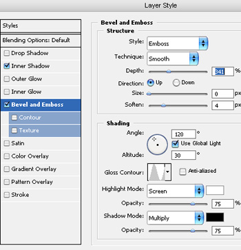  
|
||
posted by vonteity @ 2:38 AM permanent link | | | ||
 1 Creating a Flower The objective of this step is to rotate and cut the edge off an ellipse, to make half a petal shape. Create a new layer. Use the Elliptical Selection Tool to select an elliptical area. Choose a darkish red colour, and fill the area with the Paint Bucket Tool. Press Ctrl+D to remove the selection. Press Ctrl+T to transform your shape. Drag a corner around, to rotate your shape, until it's in a position similar to the one shown in the diagram. With the Selection Tool, select a large part of your shape that you wish to cut off, so that the remaining part of your shape resembles half a petal. Go back and rotate your shape if you need to.  2 Creating a Whole Petal Right-click on your petal layer in the Layers list. It should be called "Layer 1". Click Duplicate Layer. Click Edit > Transform > Flip Horizontal. Choose the Move Tool, and use the arrow keys to nudge the two half-petals around until they join to make a whole petal. Note: pressing Shift and an arrow key nudges the object around by 10 pixels at a time, instead of 1. Click on the "Layer 2" layer in the Layers list. This should be your new, rotated half of the petal. Press Ctrl+E to merge this layer down, so that the petal is all on one layer.  3 Adding Texture and Lighting to the Petal Click Filter > Noise > Add Noise. Set it to around 10%, Gaussian, Monochromatic. Set your colours back to black and white, then switch the colours, by using the little icon, or pressing "D". In the Layers list, right-click this layer and choose Blending Options. Click Gradient Overlay. Set the Opacity to 25%, but leave the Mode as Normal. Set the Angle to 90° and change the Style to Reflected. Press OK. Ctrl+Click this layer in the Layers list to select its area. Choose the Brush Tool. Click the drop-down box and choose the size 35 blurry brush. Set the brush's Opacity to 20%. Apply the brush around the outside of the petal, to create a shadowy area, as shown. Press Ctrl+D to deselect.  4 Duplicating the Petal Right-click the petal in the Layers list, and click Duplicate Layer. Click Edit > Transform > Flip Vertical. Choose the Move Tool, and press Shift+Up Arrow until the petals are arranged as shown in the diagram. You can drag the petal around with the mouse if you like, but remember to hold the Shift key, so the petal moves exactly vertically.  5 Creating One Set of Petals In the Layers list, click the eyeball next to your Background layer. This will make it disappear. Click Layer > Merge Visible. If you try to merge the layers any other way, you'll have two sets of Blending Options (Effects) on one of the petals. That would be bad. :) Right-click your layer in the Layers list, and click Duplicate. Press Ctrl+T to Transform your layer. Drag the corner around, but hold Shift, so it rotates in even increments. Duplicate your layer, and rotate it again. You should end up with six evenly-spaced petals, as shown in the diagram. Click Layer > Merge Visible. Right-click this layer in the Layers list. Give it a Drop Shadow, and press OK. Click the eyeball next to your Background layer, to make it appear again. 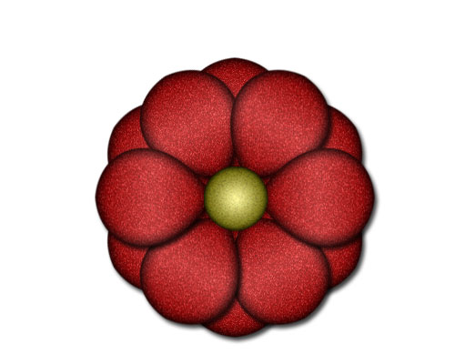 6 Finishing Touches Duplicate this layer. Click Ctrl+T to Transform it. Hold Shift and rotate the layer one notch. Create a new layer. Choose the Elliptical Selection Tool. Select a circular area in the centre of the flower. (Hold Shift while you drag, to make your area perfectly circular.) Choose a yellow colour, and fill the area with the Paint Bucket Tool. Set your colours back to black and white. (Click the icon, or press "D") Press Ctrl+D to deselect. Click Filter > Noise > Add Noise. Set it to around 10%, Gaussian, Monochromatic. Right-click this layer in the Layers list. Give it an Inner Glow, but change the colour of the Inner Glow to black. (Click on the little coloured square, below the word "Noise".) Also add a Gradient Overlay. Set the Opacity to 60%, Tick the Reverse box, and set the Style to Radial. Press OK. Make the background disappear again, and click "Merge Visible".  7 Creating the Shape of a Leaf Click File > New. Choose your settings, and press OK. As you did with the flower, create a green ellipse shape, rotate it, and delete all but a piece at the edge. Duplicate that piece, flip it, and merge them into one layer. See Step 1 if you've forgotten how to do this.  8 Adding Texture and a Gradient Click Filter > Noise > Add Noise. Set it to around 10%, Gaussian, Monochromatic. Ctrl+Click your leaf layer in the Layers list. Create a new layer. Change its Mode from Normal to Overlay. Choose the Gradient Tool and apply it from left to right, across your selected area.  9 Adding Veins to the Leaf Create a new layer. Choose the Brush Tool. Click the drop-down box and choose the size 9 blurry brush. Set the brush's Opacity to 20%. Draw a slightly wavy line down the centre of your leaf. Choose a size 5, blurry brush, and then paint in the side veins. Create a new layer. Select the size 17, blurry brush. Paint two rough, white linesâ€"one down each side of the leaf. Change your colour to black, and paint down the main vein, and around the edges of the leaf. Turn the background layer off, and click Layer > Merge Visible.  10 Creating Repeating Elements You will need to create four new images here. These images will repeat along the top, bottom, and sides of your web page. The image shown above is something like what your top image should look like. Choose the Move Tool, and drag across flowers and leaves from your other images. Use Ctrl+T to resize the flower. Hold shift while doing this, to stop the flower distorting. For each of this images, click File > Save for Web. Choose Jpeg, Quality 60. 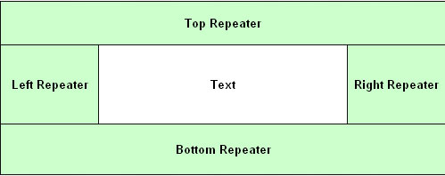 11 Setting up Your Web Page In your web editor (i.e. Microsoft FrontPage or Macromedia Dreamweaver), Insert a table with a width of 100% Give it three rows, and break the second row into three columns. Set the width of the left and right cells to whatever the width of your left and right images are. don't give the "Text" cell a width. Set your header image as the background of the cell labelled "Head Repeater". Do likewise with your other images. These images will repeat as many times as is necessary to fill up the whole height and width of the screen.  12 The Finished Product For headers, a nice touch is to create small header images in Photoshop. I've used Garamond font here, but I've increased the size of all the capital letters, and changed them to Monotype Corsiva font. Please resist the urge to bevel or shadow these images. |
||
posted by vonteity @ 1:49 AM permanent link | | | ||
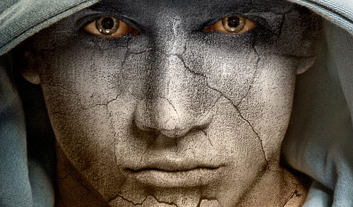 Basically, in this tutorial I’m going to be showing you how to add texture to the skin like the one in the below image. Firstly, start by finding a stock photo that you can add the texture to. For example, you can use this one or you can of course, go to Google Images and look up some picture you are interesting in. Also you need to find some appropriate stone texture. You can do it in the same way or feel free to use mine. Ok, now open up both of your photos in Photoshop, you can either keep it at it’s current size of resize it down a little bit if you want. After that bring the texture picture to the canvas with the man’s face:  Flip this texture vertical with Edit > Transform > Flip Vertical and set opacity up to 50% for this layer:  Ok, then mess with the layer mode & opacity/fill. I tried Multiply with opacity of 80%. After that apply Edit > Transform > Warp to transform the texture as on picture below:  This texture will cover the face and we need one more for the neck covering. Copy the stone texture one more time to our canvas and then change layer mode to the Multiply for the new layer, also set opacity to 80% up. After that resize it a little bit and transform is as below using Edit > Transform > Warp like on picture below:  Now it’s time to compose two different texture layers in one and cut away the textures out the skin area. Hide the upper layer (click on the eye, which indicates layer visibility) and go to lower layer with the texture. Select the Eraser Tool and a soft round brush about 20 px and process the edges to get the picture like mine: 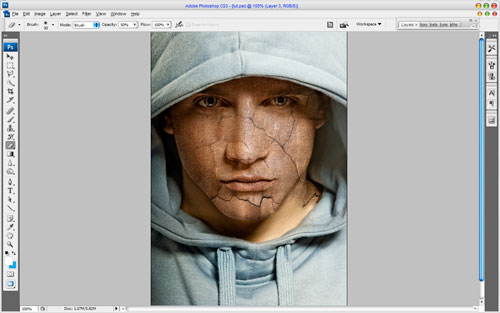 Go back to the hidden layer and make it visible again. Now process its edges in the same way. 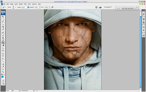 Merge two of these layers and change layer mode to Multiply again. Then you might want to make more sharpen this layer. Get out the Sharpen Tool and a soft round brush about 400 px and make a little sharpen work:  Now I would like to clear eyes area from the texture. To do this use the Eraser Tool and a soft round brush about 10 px:  Time to make the texture three-dimensional. For this effect use Dodge Tool (Range: Highlights, Exposure: 35%) and Burn Tool (Range: Shadows, Exposure: 40%) to make some parts of the face more brightness and bring some shadows to the dark parts. Try to do it more realistic. 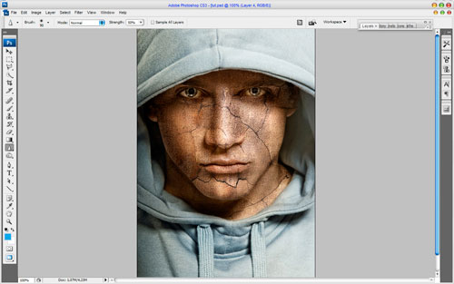 Now I would like to bring man’s clothes some sharpness. Use the Sharpen Tool (Size: 90px, Mode: Normal, Strength: 50%) to get the picture similar to this: 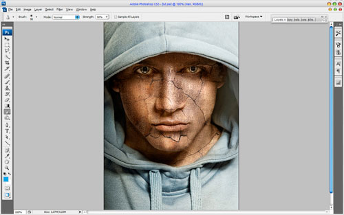 Looks good! Isn’t it? But we are not finished yet! Now time to add some color to the skin. Use Select > Load Selection to create selection as on picture below, after that create a new layer and fill the selected area with color of #331e01: 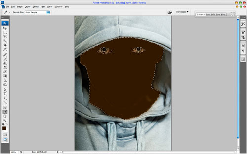 Remove the selection with Ctrl+D and change the layer mode for this layer to Color:  After creating a new color for the man’s skin I think we should add some cold hue to his face. For this effect select the Rectangular Marquee Tool (Feather: 100 px) and make selection as on picture below: 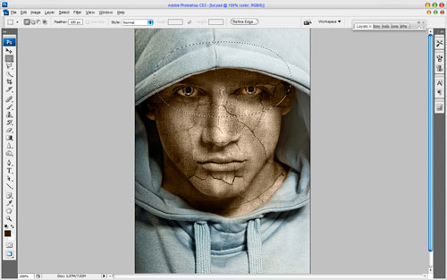 Then use Image > Adjustments > Hue/Saturation with similar settings to these: 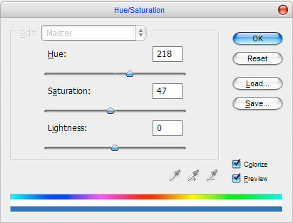 Remove selection with Ctrl+D. Now we have an effect like this one:  Looks great! To finish off the tutorial select the Eraser Tool and a soft round brush with size of 100 px and make clear the lower part of the face and neck, but a little bit! 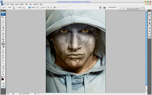 That is it for now! Read this tutorial, make it and enjoy your own cool pictures! Also thanks for visiting Web designing blog. Labels: Photoshop tips |
||
posted by vonteity @ 1:52 AM permanent link | | | ||
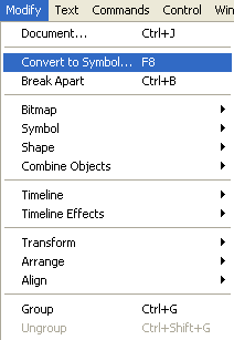
1.Open a flash document and import the following picture using File->Import->Import to Stage.  2.Select the image on the stage and choose Modify->Convert to Symbol.Select Movie Clip as Type.A new movie clip Symbol1 is created. 3.Choose the symbol on the stage and click on the Filters tab (next to the Properties tab) and using the plus(+) symbol choose Adjust Color. 4.Change the Hue Saturation Value so that the color of the image changes.We get the following image.  Labels: flash, web design |
||
posted by Treesa @ 5:04 AM permanent link | | | ||
1.Open a flash document and import the following picture using File->Import->Import to Stage
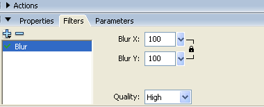
3.To create the blur effect,choose the movie clip img_blur.In Properties Inspector,select the Filters tab. Click the '+' icon and select Blur. Choose values 100 for Blur X and Blur Y and Quality as Medium.
We get the following effect:
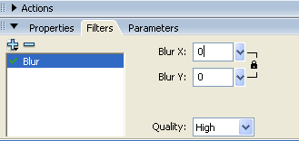
4.Select the 50th keyframe and right click Insert Keyframe. In Properties Inspector,select the Filters tab. Click the '+' icon and select Blur. Choose values 0 for Blur X and Blur Y and Quality as Medium.
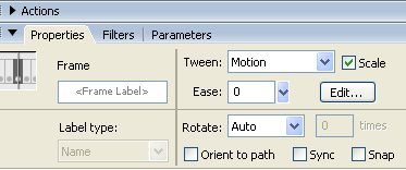
5. Select a frame between Frames 1 and 50 and select Motion from the tween pop-up menu in the Property inspector. Save the changes and press "Ctrl" + "Enter" to test your movie.
6.This is the final effect for the image. Labels: flash |
||
posted by Treesa @ 11:21 PM permanent link | | | ||


1) Label each of the layers.This helps as the Flash movie starts growing. 2) It will be much useful to convert shapes into symbols insteading of redrawing them each time.The symbols can be dragged from the library each time we need a new one.Also,utilise the colour effects pop-up to change the appearance of the symbols 'instance'. 3)Switch to Outlines mode to speed up Flash when working with complex animations. 4)To add a pre-loader later,leave a few blank frames at the start of your movie. 5)Provide a 'skip intro' option from the start when using a Flash intro in a HTML site. Labels: flash, web design tips |
||
posted by Treesa @ 6:31 AM permanent link | | | ||


Post a Comment