Photoshop tips
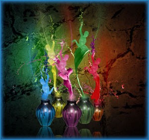
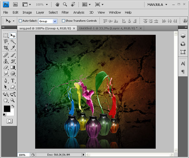
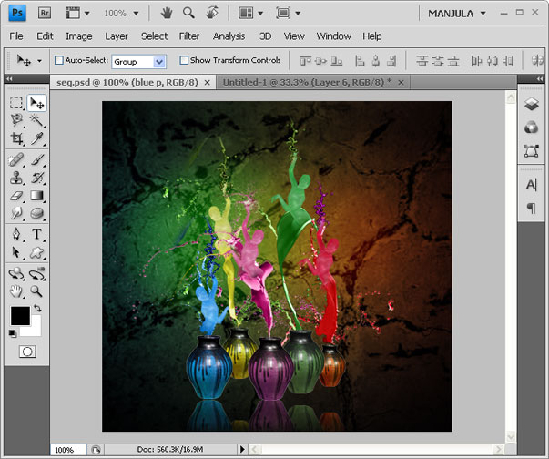
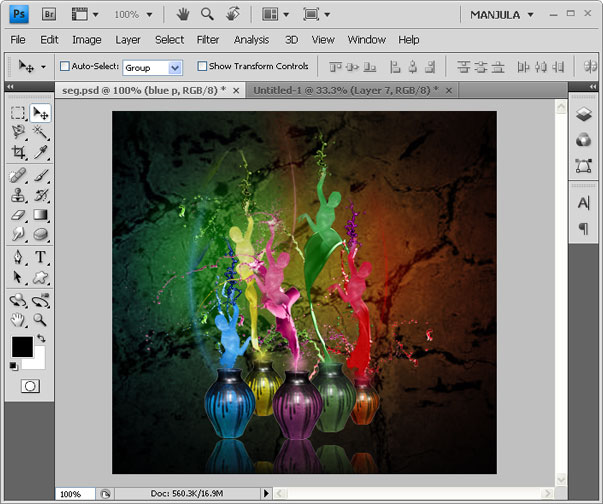
Makeup of Pot Paint Dancers using Photoshop
Final Preview:
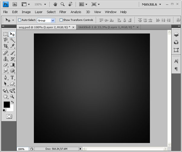
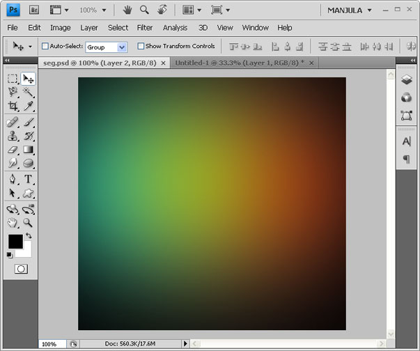
Step-1 Open a new document in Photoshop. Set background color as black. Use 300 size radius sponge brush and set grey as foreground color then click at the center of the document to bring the below effect.
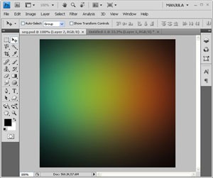
Step-2 Like above uses the 300 size radius sponge brush, click with few different colors which you like. Here I used green, blue, and red.
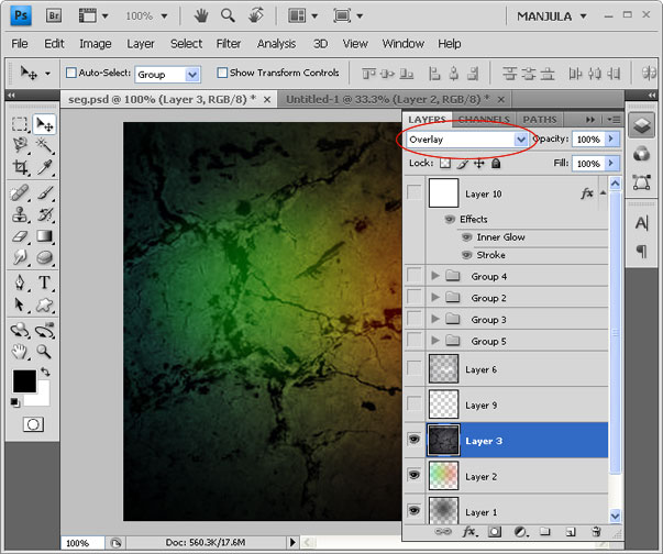
Step-3 Place the grunge texture above the colors and set the blend mode to Overlay.
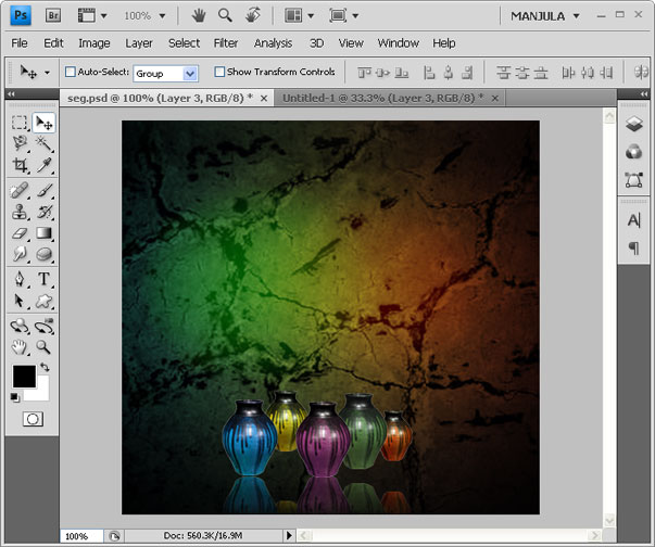
Step-4 Place the few colors pot as like below. Here I took a pot and gave Hue/saturation for remaining pot to change its color.
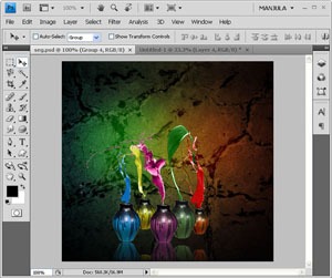
Step-5 Browse Paint tossing images and download it and place it above the pots.
Step-6 Like above, browse zentai dancers images and download it. Go to Filter –> Filter gallery –> Plastic Wrap. Then erase the bottom of the dancers using sponge brush. Place it overlap to the paint tossing.
Step-7 At the background pattern it with few brush styles.
Hope you like this….
how to use water color in photoshop cs5
Step 1
Open Photoshop and create a new document, I’m using 1920×1200 pixels.
Step 2
Add a new layer, fill it with white then make sure you have black and white for the foreground and background colors. Then go to Filter>Texture>Texturizer. Use Canvas for the Texture, 75% for the Scaling, 3 for the Relief and for the Light choose Top Right.
Step 3
Let’s add a nice texture. You can use the image of your choice. Place the image in the document on top of the other layers. After that, change the Opacity to 75%.
Step 4
Now let’s place an image in our document. I’m using a photo of a guy walking in the field . The image has to go beneath the texture layer. After that go to Layer>Group Layer. The layer of the image will be inside a folder in the Layer Palette. Select the folder and go to Layer>Layer Mask>Hide all.
Step 5
The image is hiding because of the mask. So now, let’s use some Watercolor Brushes. So select one of the watercolor brushes and them white for the color and paint on the layer mask of the group. You will notice that the image will start showing.
Step 6
Pick another Brush and paint again.
Step 7
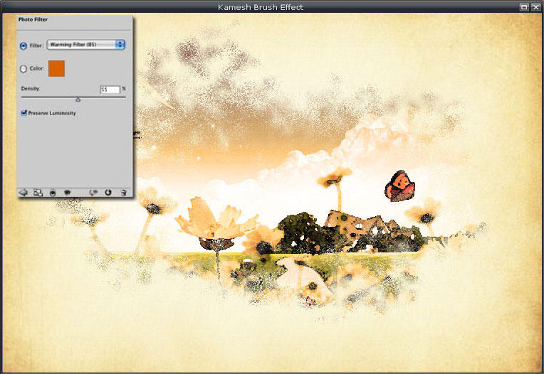
Let’s just adjust the color of the image. Select the image and go to Image>Adjustment>Photo Filter. Select Warning Filter (85) and 55% for the Density. Also select the Preserve Luminosity option
Conclusion
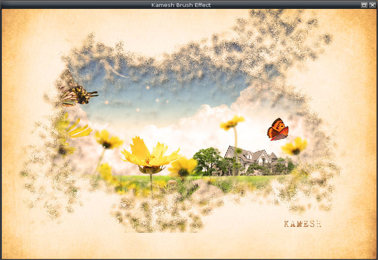
Just place your logo and that it you will have a really cool effect and super simple to achieve. That can be used for website headers to create a simply awesome design, and, of course to create posters. Also you can reduce the opacity of the paper texture. I reduced to 50%, that way we can drive the viewer’s attention to the watercolor effect.
Poster from the words in photoshop cs5
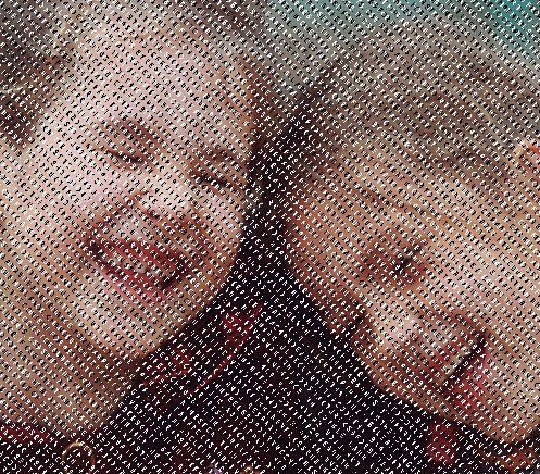
First we are going to create a new document in Photoshop with 1000×1000 pixels with all the default settings. Fill the background layer with black color.
Step 2
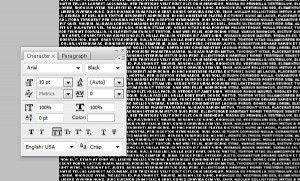
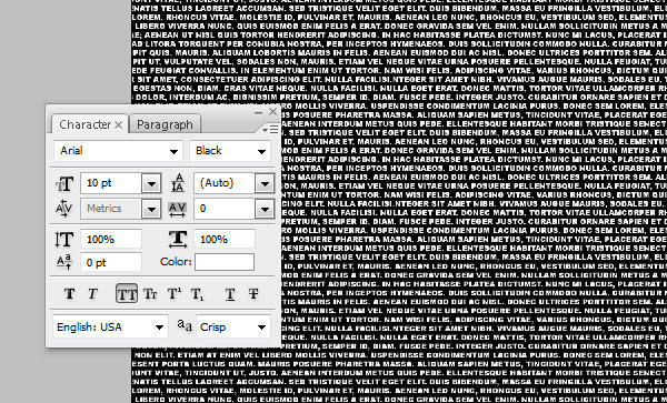
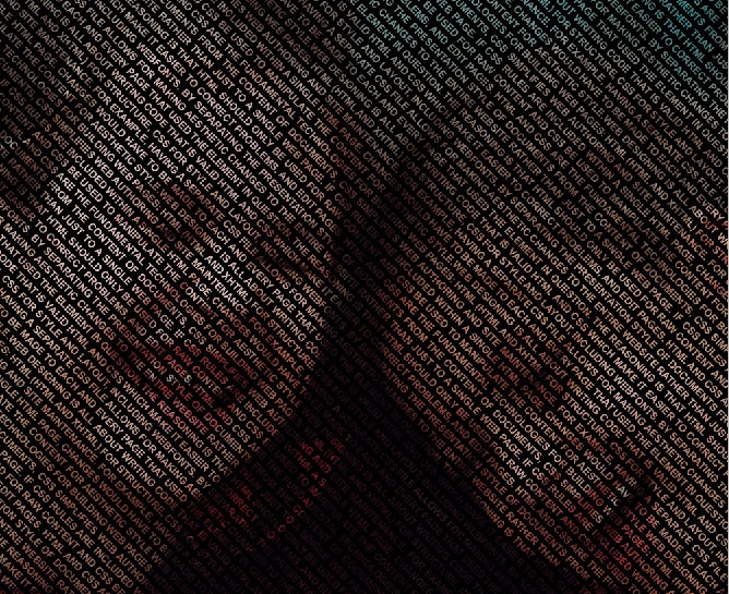
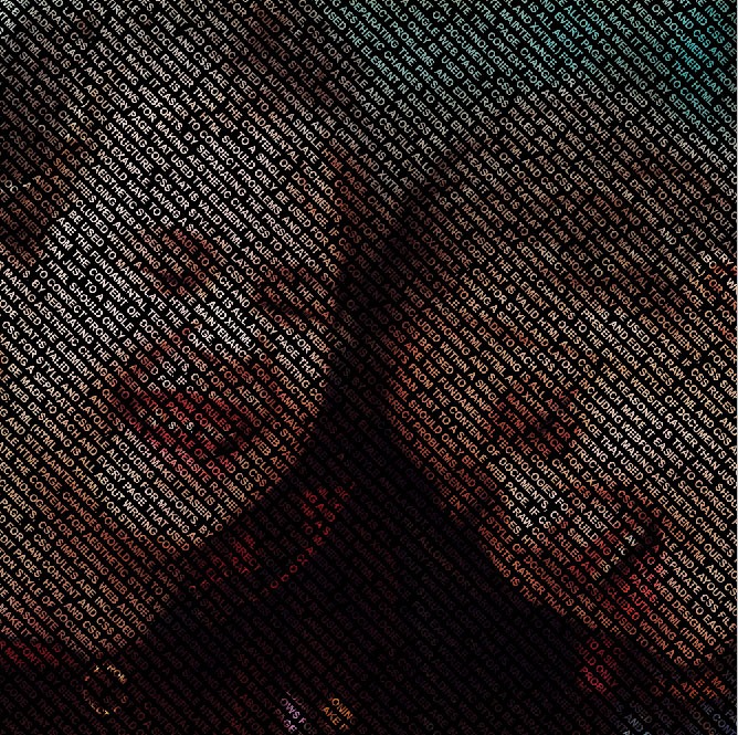
Select Horizontal Type Tool and place any text (white color, caps on) filling all background as you can see below. Only use one text layer.
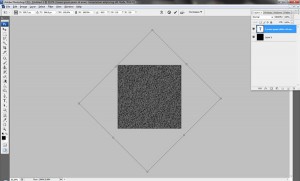
Rotate text 45 degrees CW by going to Edit > Transform > Rotate.
Step 3
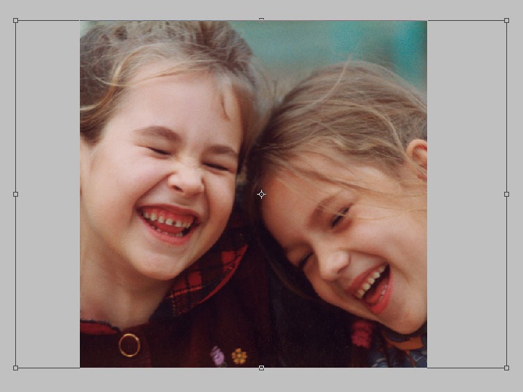
Open photo and copy it to our canvas over text layer. Go to Edit > Free Transform and resize photo to something similar to what I have.
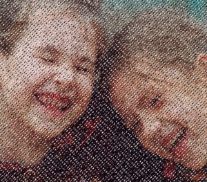
Select text from text layer (Ctrl+left click on text layer thumbnail in layers). Press Ctrl+Shift+I to invert selection. With selection active, select photo layer and press Delete to clear selection contents.
Press Ctrl+D to deactivate selection.
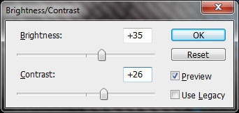
Apply Image > Adjustments > Brightness/Contrast.
Step 4
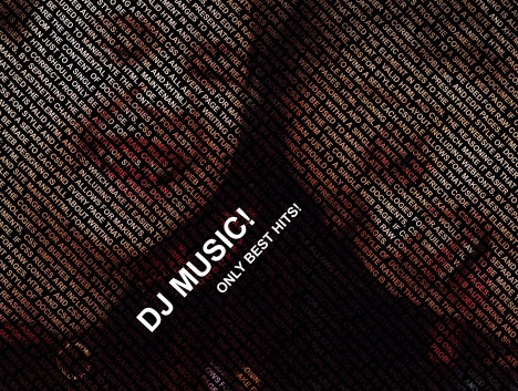
Create a new layer. Select Horizontal Tool (Arial, white color, 55px) and write something like “DJ Music!”. Create a second new layer and write “Only best hits!” (Arial, white color, 25px).
Rotate text 45 degrees CW by going to Edit > Transform > Rotate on both layers.
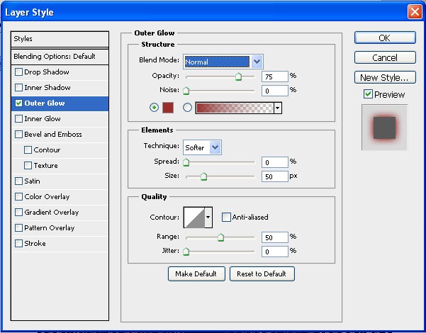
Apply Layer > Layer Style > Blending Options > Outer Glow to both layer to make it more readable.
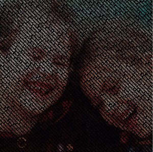
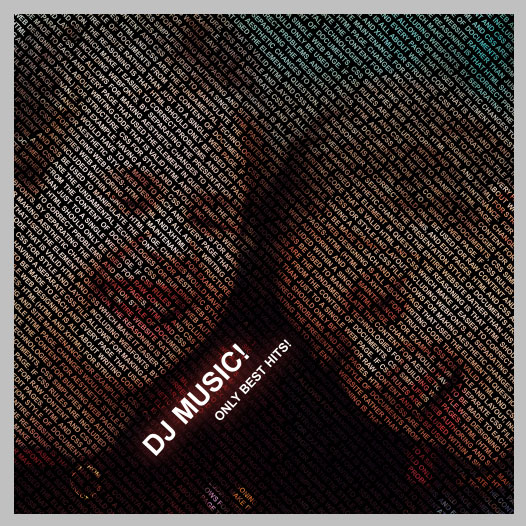
Final Image
This tutorial is now finished and you got a great effect!
Photoshop CS5: How to Create Actions
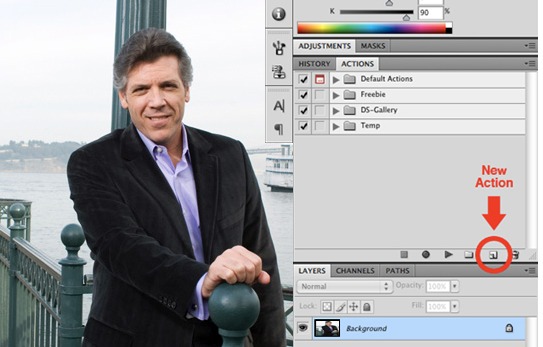
Recording an action in Photoshop CS5 is incredibly simple. Simply open up the “Actions” palette and hit the new action button seen in the image below.
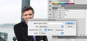
This should pop open a new window containing various options for the action. Here you can name the action and place it in a set. You can also assign a keyboard shortcut that will activate the action immediately in Photoshop CS5. This is quite handy for those actions you find yourself using on a daily basis.
Once you hit “Record” in the window above, all that’s left is to carry out the steps you’d like to be recorded in the action. Keep in mind that selection sizes, saving and other very specific steps will be replicated exactly in the action. Try to keep your steps generic enough that they’ll work on the full range of images you’ll need the action to apply to.
When you’ve finished carrying out all the desired steps, hit the “Stop” button in the action menu. Then hit the “Play” button to perform the action on another file.
Rock pattern text with floral design using Photoshop
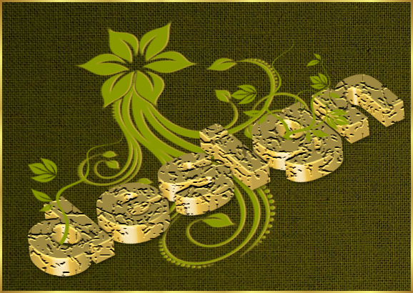
Final Preview:
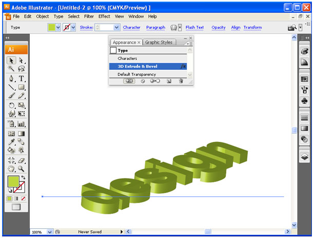
Step-1 open a new document in Illustrator, type the required text and go to Effect –> 3D –> Extrude & Bevel to get 3d text effect.
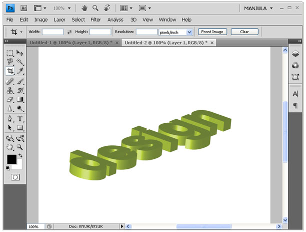
Step-2 Copy and paste that 3D text in Photoshop.
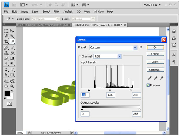
Step-3 Now go to Image –> Adjustments –> Level and give the below value.
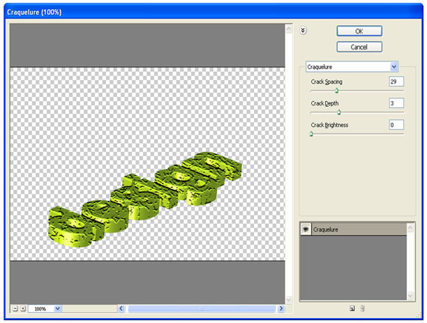
Step-4 Then select Filter –> Filter gallery –> Texture –> Craquelure and give the below value.
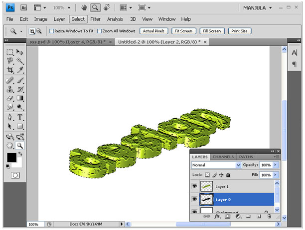
Step-5 Press Ctrl + click on layer thumbnail and create new layer above the background layer then fill black color.
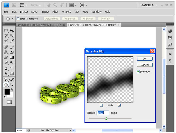
Step-6 Apply Blur –> Gaussian Blur to black filled layer with the radius of 10px.
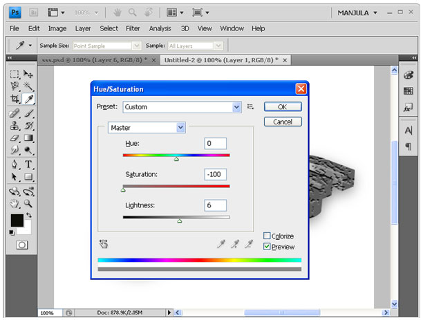
Step-7 You can change the color of text by giving Image –> Adjustments –> Hue/Saturation.
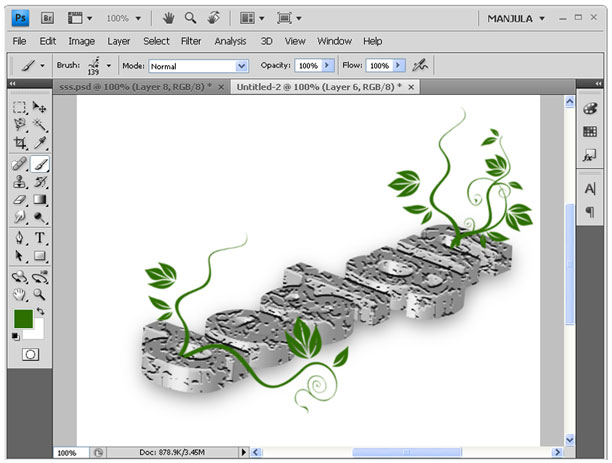
Step-8 Using brush tool create floral designs like below in new layer.
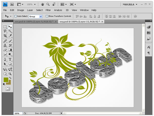
Step-9 creates a background by like below using filter gallery. First set the background and foreground color in green shades. Then go to Filter –> Filter gallery –> Rough Pastels. Give values as like follows:
Stroke Detail: 15; Stroke Length: 7; Scaling: 109; Relief: 13; Light: top left.
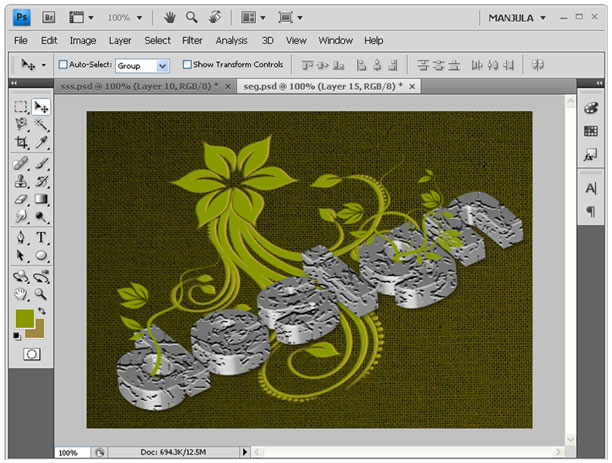
Step-10 Set stroke using gradient overlay in blending options.
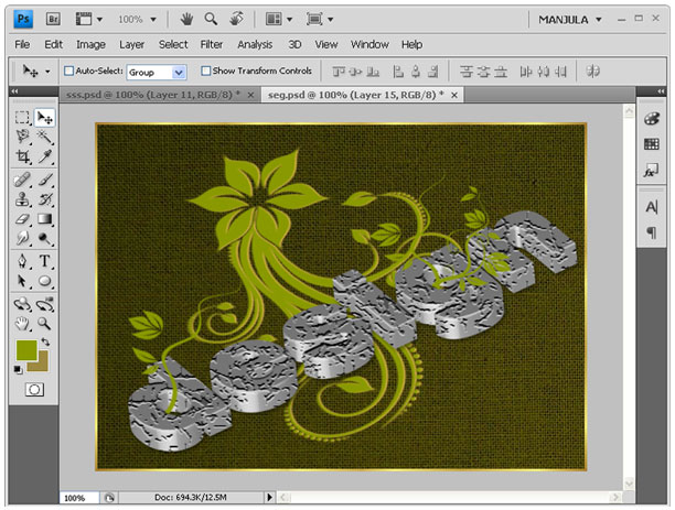
Step-11 Now I changed the text color to golden brown.
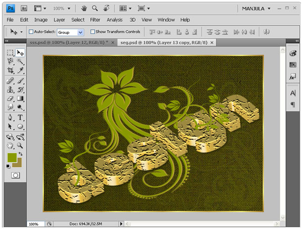
Photo Manipulation
1. Here’s the starting photo. A church in my neighborhood, surrounded by lush trees.
2. I’ve created a Set with the original photo called ‘autumn’.
I then duplicated it and positioned the copy version below the original in the layer stack.
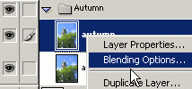
Next, right-click on the original photo layer and choose ‘Blending Options’ as I have captured below.
3. In the main ‘Blending Options’ panel change the ‘Blend If’ default Grey to ‘Blue’ and then drag the far right ‘Underlying Layer’ slider to the left as I have captured below.
4. Next, from the ‘Color Overlay’ blending option change to a color that best represents autumn leaves. (I used #F17F04) and change the ‘Blending Mode’ to ‘Hue’ as I have captured below.
Here’s the final result.
Flaming text effect
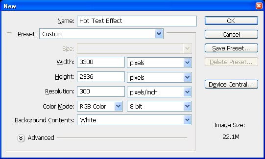
So let’s start with a new document of 3300 px width and 2336 px height at 300 resolutions. I created large document because I wanted to print it on A4 size.
Press U and select rectangle tool and create a rectangle of document size and apply gradient overlay with colors 890000 & ffb400. Now select transform tool and increase rectangle size from document size to 4515 px width and 3196px height.
Duplicate the rectangle and apply 10% transparency with normal mode. Your gradient will automatically transform and results will be like this.
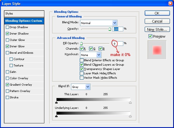
Now select type tool and write letter “H”. Font is your choice but I used here font Akashi of 180 pt weight. Go to the layer style option and reduce the Fill Opacity to zero in Advanced Blending. Now apply these layer styles.
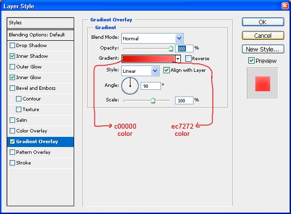
Gradient overlay: color c00000 & ec7272
Inner glow: color fba8a8, opacity 76%, blending mode screen.
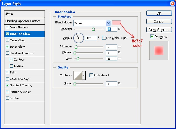
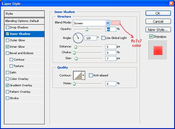
Inner shadow: color ffc7c7, 65% opacity and size 13px.
Now duplicate the letter H and name it emboss. Remove all layer style and fill opacity to 100%. Shift it slightly right and down to give it emboss look. Now ctrl + click on text layer “H” and press delete to remove unwanted area.
Ctrl + click emboss layer, right click and click on “Make Work Path”. Now select direct selection tool by pressing A and select anchor points. Adjust them and fill it with color d90000 to give it a real 3d look.
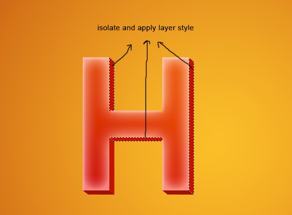
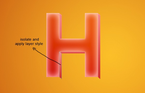
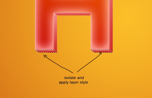
Now isolate all the faces of emboss layer like right face, bottom faces, and apply these layer style.
Apply layer style same as in step 5 here.
Now select the bottom of letter H and apply gradient overlay same as in step 5 with 90 degree angle.
Repeat step 3,4,5,6 & 7 in letter O and T. The result will look like this.
Merge all layers of text HOT and name it hot. Change its blending mode to overlay. Duplicate the HOT layer and change blending mode to darken name it HOT 1. Duplicate this HOT1 layer.
Ctrl + click HOT1 layer, select a soft brush of color black and size 100 px and paint the shadow of text considering the source of light on top left. Change its opacity to 10% and blending mode to multiply.
Now ctrl + click letter H, O, and T and save this selection to HOT and apply layer mask. Create new layer & name it shadow, load selection HOT and fill it with black color. Apply motion blur of -36 degree and decrease its opacity to 25% with multiply mode.
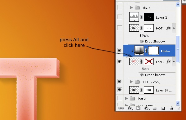
Copy HOT layer and change its blending mode to dissolve. Create a new Hue/Saturation adjustment layer with setting; Hue 6, Saturation 3, Lightness 0. Create clip mask by pressing alt + click on between the adjustment layer & HOT layer.
Duplicate HOT layer again and keep it on top go to Filter gallery choose Reticulation filter with these settings:
Density: 3
Foreground Level: 40
Background Level: 5
Change its blending mode to soft light. Name it R filter.
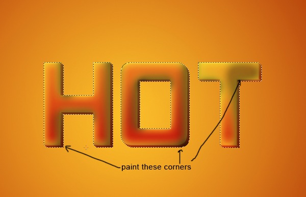
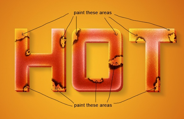
Looks good! Now select brush of 15 px size and 100% hardness, press F5 to access brush option and increase size jitter to 100% on Shape Dynamics. On the scattering option keep scatter 90%. Now click layer mask button bottom to layer pallet. Click on the layer mask, choose black color and hide the area where we’ll burn it.
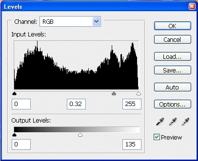
Create a level adjustment layer below R filter layer with these settings.
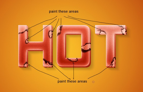
Click on layer mask, press ctrl + I. It will mask everything; now select a soft brush of size 20, color white, and opacity 70% and paint around hidden areas of R filter layer. Now ctrl + click on R filter layer and hide selected area. The result will look like this.
Add layer mask to HOT layer and hide the area outside burned texture. This will give a warmer feel to the text inside burning texture.
It’s time to add some fire on it. Drag images into document and change color mode to screen and duplicate image twice to get desired result.
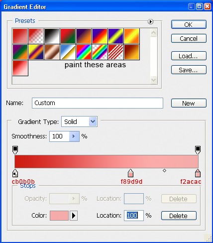
We’re near to complete. Now it’s time to add some finishing. Create a new layer select gradient tool and use colors cb0b0b, f89d9d and f2acac. Add noise of 3px, monochromatic, distribution Gaussian. Keep color mode to multiply. Add layer mask and mask areas around text HOT by a smooth brush.
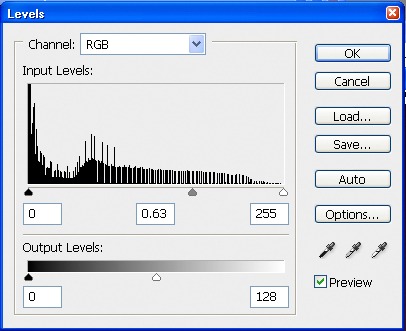
Create a level adjustment layer with these settings. Now we are facing a problem that is letter H & O is darker then T. To fix this problem add layer mask and hide area of H & O by painting soft 70% opacity brush.
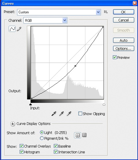
Create curve adjustment layer with input 84 and output 100.
Now create another level adjustment layer with these settings and name it level 2.
Nearly finished the whole effect but not looking very impressive right? Ok, apply layer mask to “level 2” adjustment layer, select large soft brush with color black and hide the area around fire. This will add life to the scene because we added fire’s light refracted on text and texture.
That’s the tutorial finished! I hope you’ve enjoyed it and learns something useful. Click on the image below if you would like to view the full sized final image:
That’s all friends!
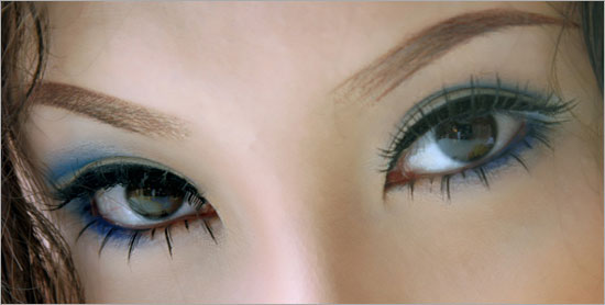
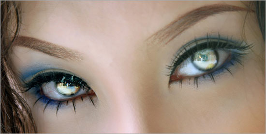
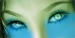
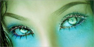
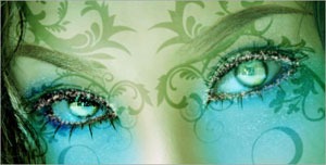
Beautiful Fantasy Eyes
Today we shall explore the basics on how we can create Fantasy Eyes effects in Photo shop.
Now Download the image and open up in Photo shop.
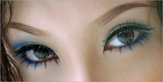
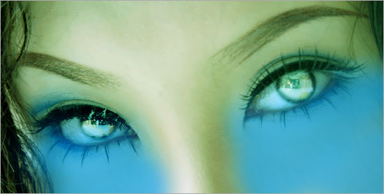
Let us start off with glowing the eyes. Make selections around the 2 black eyes with the Elliptical Marquee tool. Go to Select > Modify > Feather. Set the Radius to 20px.
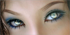
Press Ctrl+C (to copy) and Ctrl+V (to paste). You will get a new layer with just the selected area. Rename this new layer as “Eyes Glow”. Set the Blend Mode of this layer to Screen. Then duplicate the “Eyes Glow” layer for another 3 times and you will get something similar to mine below.
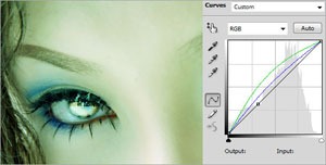
Create a Curves Adjustment Layer. Go to the Green and Blue channels and set the curves to the ones below.
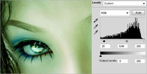
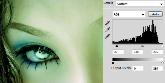
Create a Levels Adjustment Layer and set the values to 20, 0.84, 255.
Create a new layer and name it as “Face Color”. Set the foreground color to #45ADCA. Using the Soft Rounded Brush with size 200px, paint the face below both eyes. Set the Blend Mode of this layer to Soft Light when you are done.
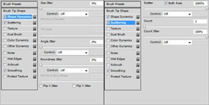
Open up the Brush panel and key in the settings as shown below.
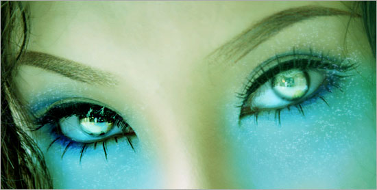
Create a new layer and name it as “Glitter”. Using the Brush tool with size 3px and color #FFFFFF, brush around the bluish area to add the glittering effect. Right-click on the “Glitter” layer and go to Blending Options. Choose Outer Glow with its default settings.
Repeat the earlier step for the border around the big pair of eyes.
This step is really random. You can start designing how you want to add some patterns to the face. For mine, I downloaded the Swirl Curls from CreateSk8. Place the floral patterns around the eyes area.
Merge all the pattern together in a single area. Go to Image > Adjustment > Hue/Saturation. Make the Lightness to -100. This will turn the pattern in to black. Set the Blend Mode of this layer to Soft Light. Go to Filter > Blur > Gaussian Blur. Set the Radius to 2px.
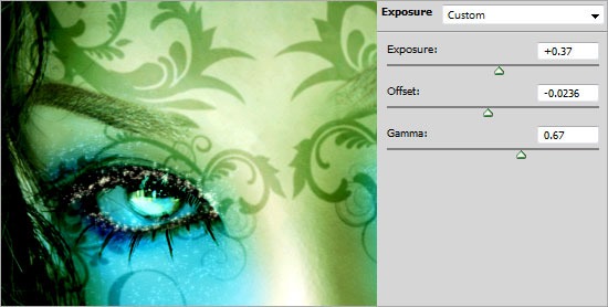
Create an Exposure Adjustment Layer and key in the settings below.
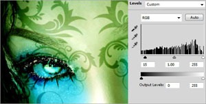
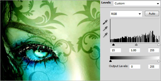
Create a Levels Adjustment Layer and set the values to 15, 1, 255.
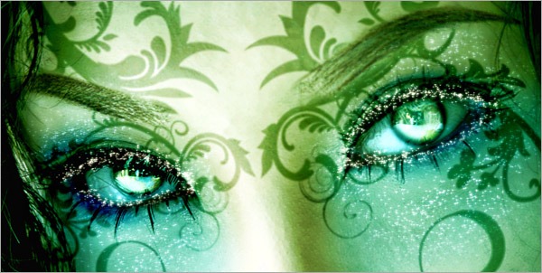
And there you have it! Thanks for reading.
Realistic View Tears on Face
In this Photoshop tutorial I would like to invite your attention to the unique technique how to make realistic view tears effect.
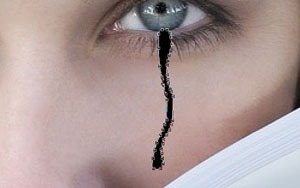
So, in the beginning you should find a good picture to work with. You can try to find it on stock photo web sites or also can use mine. Open up the picture. Then select the Pen Tool and try to make good form of the tear with black color.
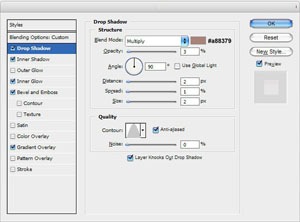
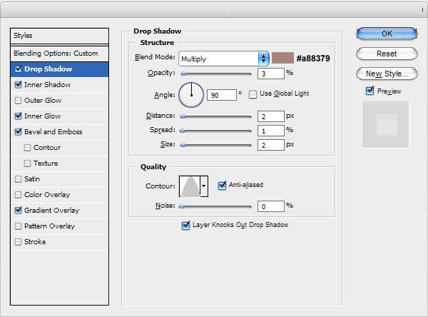
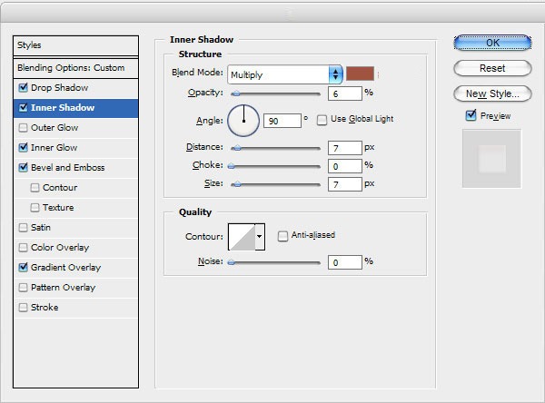
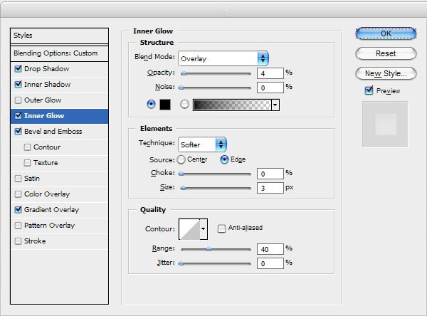
Pay your attention that the form must be how much more uneven to be similar to a real tear. When we are done with form, then change layer mode to Screen for the current layer and apply following Blending Options:
- Drop Shadow
- Inner Shadow
- Inner Glow
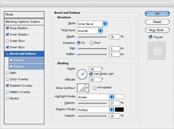
- Bevel and Emboss
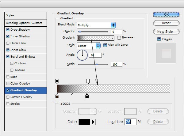
- Gradient Overlay
The result should be next:
Looks good, but not so realistic for now. I would like to bring some white glare to this form. Select the Pencil Tool and brush about 1 pixel, then make a few dots with white color on the new layer like on my picture below.
After that apply Blur Tool to current layer.
We got a nice realistic view result isn’t it? Don’t be afraid to experiment and you will get your own cool effects!
Papercraft Text Effect
Go to FILE > NEW… and create a new 600px 200px document with a white background. Check the image below if you are unsure about the settings.
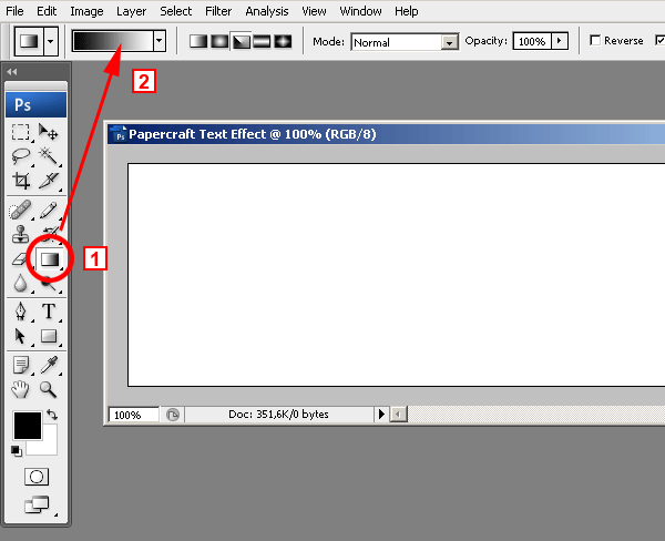
Now let´s create the gradient for the background. In actuality, this is the gradient that we will be using for the text effect. It simply looked nice as the background too. 1 – Select the Gradient tool. 2 – Click on the gradient and the gradient editor window will open.
1 – Create the new gradient using the settings in image below.
2 – Click on the NEW button and give it a recognizable name.
3 – The new gradient will appear on the gradients library.
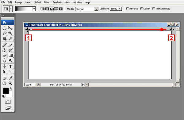
Select the gradient tool and then from the gradients pull down menu (1), choose the gradient we are just created (2). Select the ANGLE GRADIENT option
Check the image below to see how to apply the gradient. Place the cross on the top left corner of the image and drag it to the right.
It is very important to start (point 1) the gradient at the very top left corner of the image or even outside the image, but never inside the image, it won´t look good.
Since we are using the ANGLE GRADIENT option, it doesn´t matter where you release the mouse (point 2) as long as you keep the line horizontal.
You should get a result similar to this image:
Get ready the Text
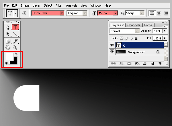
Before starting, download the Disco Deck font and install it on your system. After installing the font, select the Text tool, set 150px as the font size, and type the letter C.
Press CTRL + ENTERto release the tool. Click again with the text tool and a new text layer will be created. Type the letter R and release the tool again by pressing CTRL + ENTER . Do the same over and over until you have all the five letters on a different text layer each:
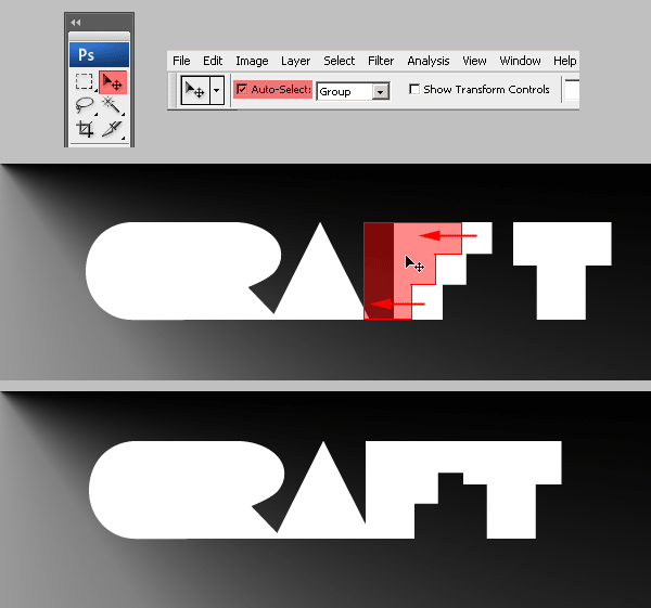
Now we are going to arrange the letters to get the overlapped look of the final effect.
That should be fairly easy. Just select the MOVE tool, check the AUTO SELECT option, and drag each letter closer to the other and overlap them as much as you want.
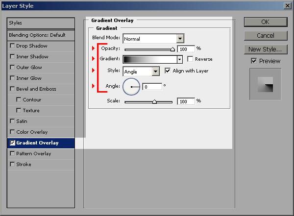
Go to the LAYERS PALETTE and select the layer with the letter C in it. Then choose GRADIENT OVERLAY from the Layer Effects pop-up menu.
DON´T press OK yet. Remember to use the new gradient we have already created some steps before:
Now click on the DROP SHADOW Layer Effect and use the following settings. Keep the window open, DON´T press OK yet.
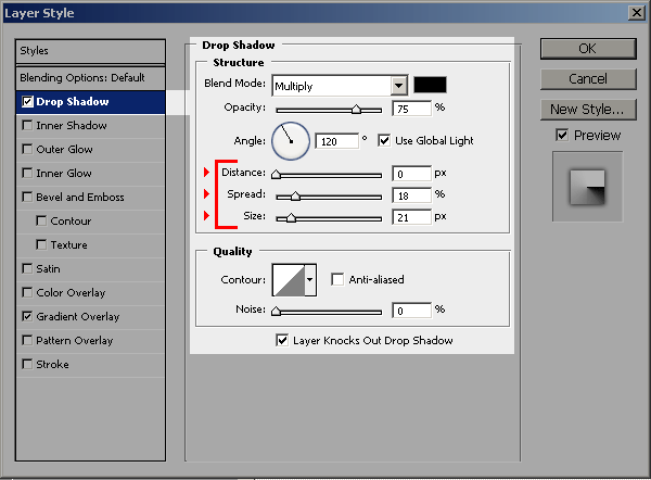
Click on the STYLES option on the top of the window and then click on the NEW STYLE button and give it a name. The newly created style will show last on the list of styles. Now you can press OK to close the LAYER STYLES window.:
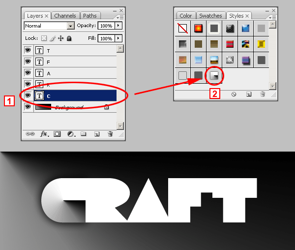
To apply the new style to each letter you must select a layer (1) and then click on the new style on located on the STYLES PALETTE (2).
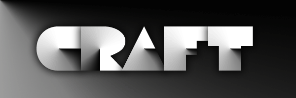
Repeat the same for each letter. Don´t worry about the results. They will look incorrect but we will deal with that later. You will end up with something like this:
Although the effect is complete, the simulated paper cuts don´t look good. Let´s correct that. Go to the LAYERS PALETTE, select the layer with the letter R and click on the tiny arrow at the right (1). This will display all the Layer Effects of the text layer. Double click on the GRADIENT OVERLAY effect (2). This will open the LAYER STYLES window displaying the Gradient Overlay settings.
Move the LAYER STYLE window until you can see the letter R. You should do this because you can only edit the gradient position of the letter R while the LAYER STYLE window is open.
First, type -90 in the Angle setting of the Gradient Overlay window or you can also drag the gradient angle selector until it reads -90 degrees You will see how the letter R gradient has changed its rotation and it is vertical instead of horizontal. In the next step we will move the gradient a little bit to the left to make it look better.
You should still have the LAYER STYLES window open. If not, then open it as explained a couple of steps above. Now check at the top of the screen and you will se a message that says Click and drag to reposition the gradient. This means that while the LAYER STYLES window is open, you will be able to exactly click and drag the gradient inside the letter R, and reposition it at will.
When you are done, close the LAYER STYLES window. You image should now look like this one:
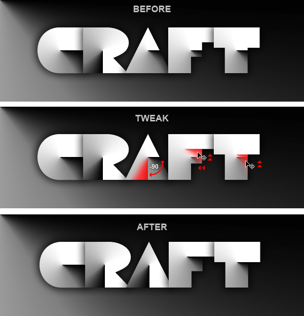
To reach the desired result, you should continue tweaking the rest of the gradients until they look like the final result. Check the image below to see a diagram of the changes you should make:
Giving a Touch of Color
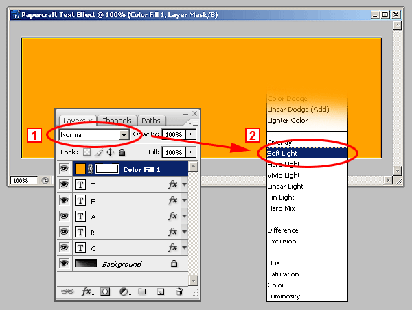
Choose a color. Any color you want. You will be able to change it later. In this case we used #FFA200. Click OK and the layer will be filled with that color.
After that, Go to the LAYERS PALETTE and from the BLENDING MODES pull down menu (1), select SOFT LIGHT (2).
Finally! Here´s the finished Paper craft Text Effect.


